Image Specifications For Designers
As a designer, it’s key to ensure that the assets you supply are created correctly for their end-use.
Assets in a digital sphere have quite a few more considerations than assets for print.
Review wtwco.com Image Specifications for Web and Digital Properties, then jump to creating image assets:
General Web Imagery Considerations for Designers
Accessibility – remember that legibility of infographics still applies. This means that the contrast of the text on the background must reach Level AA accessibility standards. Use the color palette as established in this digital style guide, and consult the colors and accessibility section as well.
Contrast Checker Tool: Contrast Checker Tool from Level Access
Text Accessibility: Inline graphics and infographics are images and therefore are not accessible by default. This means that a portion of the population cannot view/access our content (e.g. those with impaired vision). In order to ensure that we are complying with accessibility standards, each infographic must be accompanied by at least one paragraph that tells the infographic’s story. This is placed below the infographic and provides a proper explanation of the image’s full content so that we are not neglecting our impaired users. This is different than the introductory paragraph, which introduces the infographic and its relevance to all users.
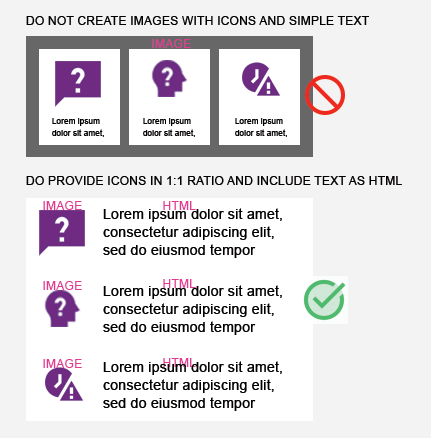
Text density and wordiness – Content should be easily scanned. With certain exceptions (infographics), imagery should not have too much text and should not have text in paragraph format. If more than one sentence is needed, this should be rendered in HTML, with associated imagery (icons, photographs, etc) paired with the paragraphs within HTML.
Endless length – Though users do scroll, we should not force them to process too much within an infographic or inline graphic. If there is a lot of content, consider breaking the content into organized sections / pages. Maintain a max height of 3000px for your infographic.
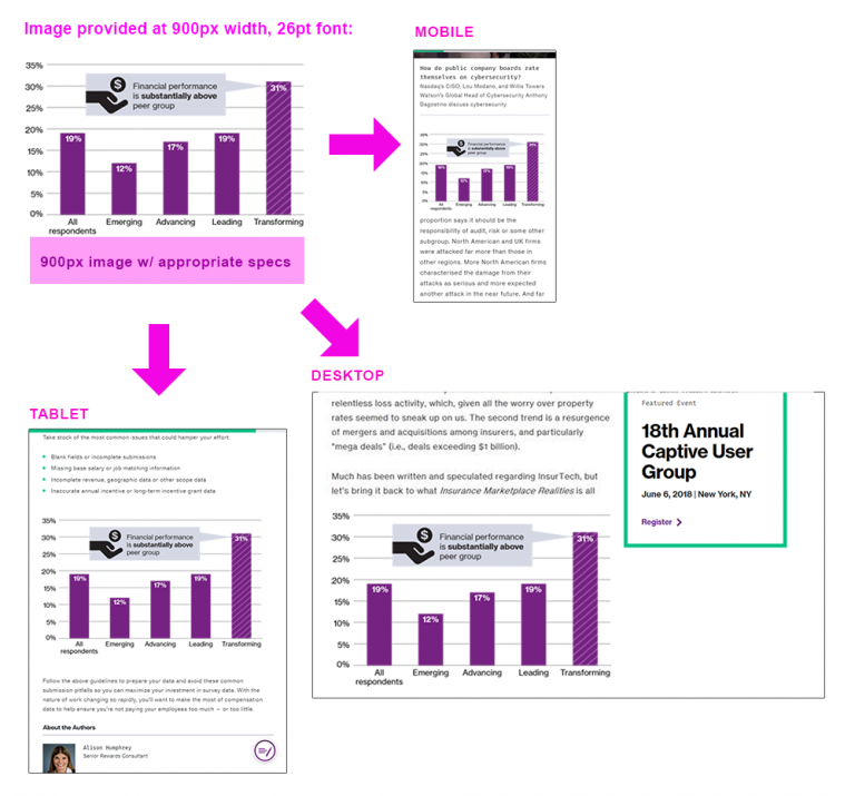
Remember responsive design – Though we design at 900px wide, this width is for a desktop format. Our infographics dynamically resize for smaller (mobile) sizes. In this case, we need to ensure that the content we place on the 900px default image scales down to a smaller device width (e.g. an iPhone) and still remains legible. Follow the specs provided for the minimum text sizes. In the example below, see how an infographic scales across viewports:
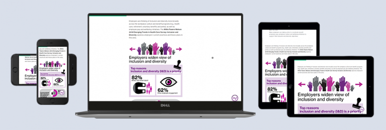
Text/font-size: For web legibility, main text must display at a minimum of 26pt Neue Haas Grotesk Roman. The above graphic notes how, while the infographic is designed at 900px wide, it remains legible at all viewport sizes (mobile, tablet, desktop). See example below:
No padding/bleed for web-based graphics on wtwco.com – Since our column structure and grid require alignment, and our canvas is white, all infographics provided should be flush to the maximum width of the canvas.
Inline Graphics: All inline graphics for wtw.com should be created with a 900px-wide canvas and the minimum font size should be 26pt. For an infographic-type graphic that has more than one section, each section should span one-column (900px) and stack vertically, not side by side. If the information is simple, instead use a simple icon snippet or a statistics module to deliver the information.
- Use icons by themselves with an icon snippet instead of embedding them in one large image, if possible:
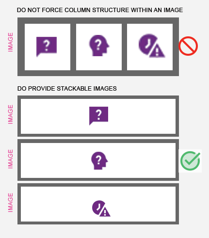
- Create stackable image sections vs. including images in columns within a singular image, if possible. This helps us be more mobile-friendly.
File type: Generally, PNG or SVG(for willistowerswatson.com) (for vector-based images), JPG (for images with photography), CMYK PDF (for downloadable version) – please see chart breakdown for more specifics:
| Image Content                             | File Type                                | Examples                                                                  |
|-------------------------------------------|------------------------------------------|---------------------------------------------------------------------------|
| Words and Illustrations / Vector Graphics | PNG or SVG (with transparent background) | Infographics Inline graphics Charts, graphs Data Visualization            |
| Photography-only                          | JPG                                      | Featured content images Hero images with photography Headshots (people)   |
| Photography + Illustrations               | PNG                                      | Blended (photography + illustration) hero images, featured content images |
| Social Media Imagery                      | JPG                                      | Twitter, Facebook, LinkedIn                                               |
Image Creation Guidelines & Specifications for Designers
You’re a designer, and you’re asked for an image asset (or multiple assets). It’s your responsibility to provide an image in the proper specifications for the end product, and therefore, you’ll need to ask a few questions to ensure that you deliver something that usable by the web team.
First, define whether you’re being asked to supply:
- Photography – e.g. a headshot of a person for a biography, a brand image for a hero, a featured content image
- Infographics – review Infographic creation guidelines on Brand Central, and work within the guidelines / templates provided by the Brand Design team. Reach out to Diane Gwon for more information on infographic creation.
- Infographics must tell a story. They are not infographics if they are merely proof points or stylized statistics.
- Inline graphics – this is how we refer to any graphic that is within a piece of content. It is not a hero image, a featured image, etc. Instead it is (usually) an illustrated chart, graphic, or “mini infographic” that provides a small amount of information. On wtwco.com, we try – as much as possible – to use images only when HTML text and supporting icons/graphics will not suffice. For some types of content, images will be photography – e.g. a photo of multiple WTW consultants at work. This is fine. The only photography we discourage in the main inline areas of pages are brand photographs as they do not add information that is pertinent to the user experience.
Define whether you actually need an image, or whether the asset could be completed within HTML.
Are you asked to design a:
- Statistic? We have an HTML module for statistics, which is branded, usable, accessible, and mobile-friendly. Image not needed. Please revert to the requester.
- Basic table? We have an HTML module for tables, which is branded, usable, accessible, and mobile-friendly. Image not needed. Please revert to the requester.
- Simple icon + supporting text? We do that in HTML, and have a few variations for display. Image not needed. Please revert to the requester.
Start designing using the guidelines on Brand Central:
Contact the Brand Design team for approval on infographic and inline graphic design by submitting a request to the Help Desk on Brand Central.
Frequently Asked Questions
Can I export a graphic from a PDF or other file type directly for the web? Generally, no. Not unless that PDF was already optimized for the web (and it likely was not). Why? Accessibility, legibility, file size, consistency, and standards. Follow the guidelines for creating web imagery, and provide the correct file type, size, etc, as specified above and in this guide.
Are there templates I can follow to create an infographic or inline graphic? The design team ( Diane Gwon) can provide existing infographic work as a basis. Please note that fonts cannot be distributed to to outside vendors; they must (according to font licensing) purchase their own version of Neue Haas Grotesk.
Where can I find our Brand Image Library for photography? Visit Brand Central’s Image Library.
Do we have a style for iconography? Consult Brand Central’s Iconography.
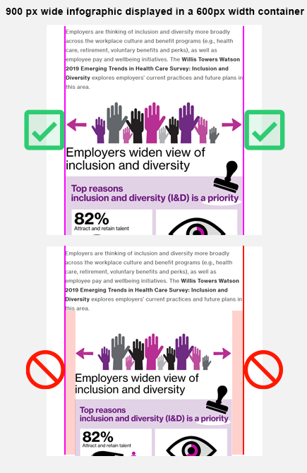
Can I provide an image with a width smaller than 900px? Yes, this is possible. However, the typography must still meet our specifications, and this image would need to be added to a smaller container (a “left-peeking” container) if on an insights page. Or, if on a capabilities page, the image would need to display at less than 1/2 width of the column. We ask that images be provided at no smaller than 600px wide unless they are icons.