Icon modules are available as visually appealing, accessible snippets to convey information that may have previously existed in the form of an image or inline graphic. With these, you will need a PNG or SVG icon and text, or a webfont icon.
Typically, the stylized list is used for larger prominence, whereas this icon module will be used in body text – for example, in article pages – to associate an image with content.
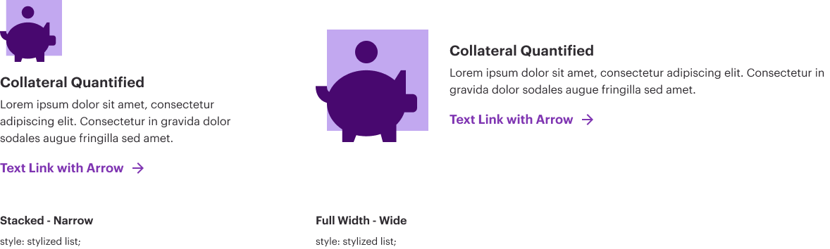
With the brand refresh, we no longer place our icons on a background in the web environment. They must always live on white. (The exception being if you have icons within an image created by a designer.)
Icon modules are available as visually appealing, accessible snippets to convey information that may have previously existed in the form of an image or inline graphic. With these, you will need a PNG or SVG icon and text, sized appropriately in a 1:1 ratio at 150×150 pixels.
This looks somewhat similar to the Stylized Ordered List with Images. Typically, the stylized list is used for larger prominence, whereas this icon module will be used in body text – for example, in article pages – to associate an image with content.
While there is no limit to the number of Icon + Text elements you can have on a single page, be mindful of your user and do not overload them with icons supporting every bit of text. The visuals should aid the user experience, not detract from it.
You may use this module without the icon and simply have a grey background behind your content; this is useful for related content like fact boxes which do not fit in our Quotes (Content or Quote) and do not fit in our other related modules. It is simply, in that case, a shaded grey box with information.
This page documents how to use this module/snippet, assuming that you have bespoke/custom icon images that you are using. You may also use the Web Icon Library for free, easily-customized icons. More information is found on the Web Icon Library reference page.
There are multiple ways to implement the module depending on the content you have.
- You can use multiple and they will stack as expected.
- The icon will size automatically per browser viewport size.
- It is recommended to be consistent with the text you are using. For example, if you have three icons with supporting text, that supporting text should all be the same size.
- Do not use large, bold text when it isn’t needed.