Button Call To Action
Call-to-Action Button
Overview
The call-to-action button module allows for individual call to action buttons to be added to an email. This module is useful when constructing a simple email with text module, or if you need flexibility from the existing modules in order to make a button more prominent.
An example might be a call-to-action after some text to take a survey.
Visual
There are three ways to display the Call-to-Action Buttons. They can be simple buttons (either primary or secondary are the module options in Marketo).
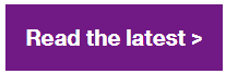
You can also turn the Primary Button into a full-width violet banner CTA to be similar to the Call-to-Action Module found on wtwco.com.
Specs
There are two available styles – the primary and secondary styles. No other configurations should ever be used.
- Do not add other background colors to the buttons
- Font-family is customizable for location; never use Fira Mono for the CTA buttons
Usage notes
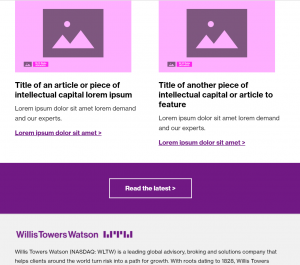
Below is an example of using this module to break up text-heavy content, especially when an email is relatively simple in nature, and does not have additional media items to feature.
The example also demonstrates the secondary button style that is available.

Marketo module configuration
You must always update your call to action text and add a working URL to each button.
Standard button
In order to configure the standard button, you must change the variables outlined in green below.
- Button – Call to Action
- Button – URL
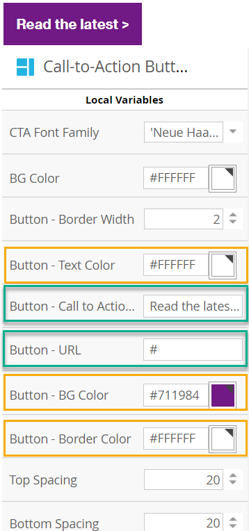
Yellow simply highlights the default colors in this module.
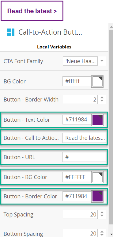
Secondary Button
To use the secondary call-to-action style, modify the variables as noted below. Observe the following visual design changes:
- Button border changes to #7f35b2
- Button background changes to #ffffff
- Button text color changes to #7f35b2
Using a flood of violet to match our call-to-action modules
To use the flood of violet full-width call-to-action style, modify the variables as noted below. Observe the following visual design changes:
- BG Color: change to #7f35b2
- Top spacing: change to 40
- Bottom spacing: change to 40
Video: how to modify Call-to-action Button – Primary
How to modify Call-to-action Button – Secondary
Video: Applying proper spacing to buttons