Email Design System
Our digital design system is extended into email. Different decisions are made for email as email clients do not render code the same as our web platforms.
Email standards need to take into account different email clients and platforms. For the web, CSS (cascading style sheets) allow us to style HTML on a consistent basis. Unfortunately, not all email clients use CSS the same way. Some don’t even accept CSS. For a full reference of CSS values in email/web, visit:
On this page, we’ll document the ways that email design extends the digital design system based on what can and can’t be done in email clients.
Table of Contents:
Typography
Our brand and digital design system uses a serif and a sans-serif, as documented within our overall digital design typography standards. While most email clients do not support webfonts, we have designed for the “best-case” scenario for e-mails so that – in the instances we are allowed – we can best display our brand typographic assets.
Font Families
We use Lyon (serif) and Graphik (sans-serif) for our webfonts, and Times New Roman and Arial are the default web-safe font for all email clients. Consult Litmus/Email Client Support for more information.
Limited support email clients include:
- Apple Mail
- iOS Mail
- Google Android
- Samsung Mail (Android 8.0)
- Outlook for Mac
- Outlook App
Our webfonts will appear stylized on the above email clients. On any other email clients, the default web-safe fongs will be used.
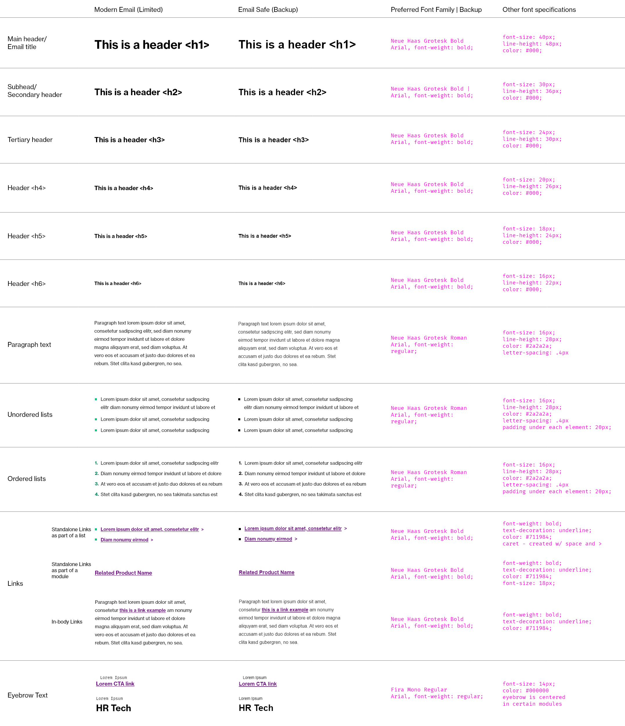
| Font Family | Universal Support? | Limited Support? | Backup |
|---|---|---|---|
| Graphik Semibold | no | yes | Arial font-weight: bold (700) |
| Graphik Regular | no | yes | Arial font-weight: regular (400) |
| Lyon Display | no | yes | Times New Roman font-weight: bold (700) |
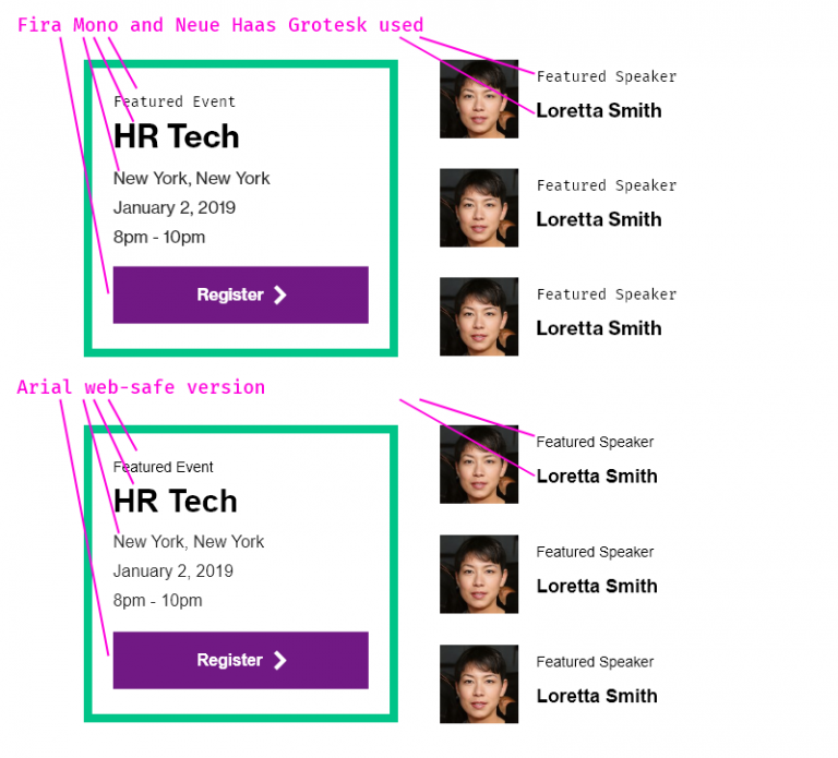
Font Replacement Example
Take a look at how one module (the Featured Callout Module – which uses Fira Mono and Neue Haas Grotesk) would appear on all email clients that did not accept the webfont property. As you can see, the module still looks properly branded. To the untrained eye, this still has a well-branded visual aesthetic.
Font specifications by typographic element
Do not deviate from the below specifications. Typography must be consistent. Do not use other colors for typography.
Font replacement for other cultures
Fonts can be updated based on local language requirements.
Currently we have defined standard (web-safe) font replacements for: Korea, Japan, China, Taiwan.
| Location | Font Family Name |
|---|---|
| China | Microsoft YaHei |
| Taiwan | Microsoft JhenHei |
| Korea | Malgun Gothic |
| Japan | Meiryo UI |
| Default, non-branded | Arial |
Contact the Brand Central Help Desk for additonal culture needs. They will route you to the proper design team representative.
Imagery
As a reminder, imagery is designed to be complementary to text. It should not contain important information that is not also found within HTML text. In the few cases where text needs to be in the image, ensure that the alt attribute has information conveying what the image is conveying (accessibility considerations).
Imagery Dimensions
All imagery within emails is standardized into two dimensions (16:10 ratio, 1:1 ratio) with very few exceptions, which are noted within specific modules. Always optimize your imagery for digital purposes. Make the image as small as possible while retaining the quality of the image. This helps with performance and provides a better experience.
- 16:10 ratio image; 800px x 500px – .jpg (for photography) or .png (for illustrated/vector-based images); must be 72 dpi (no more, no less because of Outlook-related issues), must be optimized for digital. Aim for less than 200kB.
- 1:1 ratio
- Icon: 105px x 105px – .png
- Consultant/person headshot: 105px x 105px – .jpg
- Aim for less than 50kB
- Other: Some modules call for 300px wide imagery (e.g. the Featured Content w/ CTA Button), and other modules can accommodate any size imagery (e.g. the Image Module), as long as it is optimized for the email send. Follow all guidelines within the each specific module’s documentation to ensure that your imagery is properly sized and exported. Optimize your image as much as possible.
Types of Images
Emails can contain the following types of imagery, which should always be on-brand.
Review Marketo Email Assets to evaluate imagery assets that you can incorporate into your emails.
- Photography –
- All brand imagery is found on Brand Central’s Image Library
- Headshots – must follow our guidelines for consultant/associate headshots
- Iconography – Either bespoke (on-brand) icons, software product icons, or sourced from the Web Icon Library
- Logos – standard logo, sublogo, alt displays are controlled at an admin level within snippets
Links and Buttons
The presentation of links and buttons in e-mail should be consistent and well-branded, and should take into account specific needs for contrast and legibility across various platforms, screens, and devices.
- Links and buttons must be well-distinguished from regular, non-clickable text
- Links and buttons must be consistently formatted for the user
- Links and buttons should encourage clicking through to content that is on the web so that we can obtain metrics and analytic data on elements within the email. With the exception of e-mail communications from clients, most e-mails (newsletters, featured products, reports, etc) are best-served by engagement, which we can better monitor when a user clicks on a link or button. For example, if all of the content was found within an email (and did not prompt the user to take action via a link or button), it will not be possible to know which part of the email was most interesting, or which content the user engaged with most.
See above the Typography section for specific typographic styles for links. Also, see specific documentation on how to ensure link consistency within modules, including ensuring the chevron is used consistently.
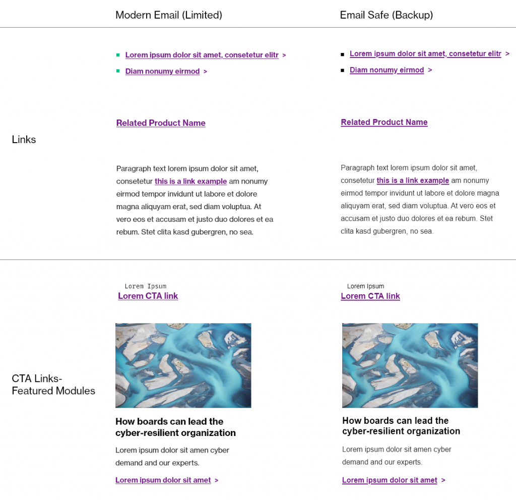
Link Design Specifications
All links must:
- Display in WTW Violet (#7f35b2)
- Text should be bolded
- Include a space and a > chevron (manually added using
>code if needed) if a standalone link as part of an unordered list
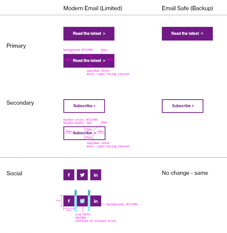
Button Design Specifications
All buttons should:
- Match a primary or secondary button style
- Text should be bolded
- Include a space and a > chevron (manually added using the > or > code if needed) if a standalone link as part of an unordered list
- Regular buttons – 40px padding left/right, 15px top/bottom
- Social buttons – 44×44 px for touch-based devices
Spacing
The key to a good (email) design is adherence to design guidelines and the proper amount of spacing between content.
When spacing is inconsistent, it is hard for a user to process “sections” of content. Images, text, and other elements “spill together” and create clutter.
When spacing is consistently applied, the email will have a positive effect on the user. Be careful to use the correct amount of spacing. Too much, and the user will be discouraged. Too little, and the content will be hard to read.
Try to apply spacing in a consistent manner.
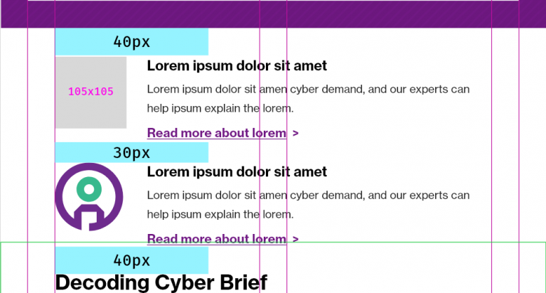
- 40px of space between “main” modules that are vertically stacked (the exception is the header and the footer).
- 20px of space between segments of modules
- 15px or 30px space between paragraph text and the top of a button – this depends on paragraph text above, and needs to be fine-tuned while creating the email. Generally, the space should be 30px above a button, but in the example below on this page, the descriptive text above was short, leaving a lot of white space, so the button space on top was shifted to 15px.
- 40px below a button before the horizontal divider rule / next element
Refer also to the spacer module documentation.
There should be 40px of space total between main modules, and 30px of space in between modules of similar characteristics. So, for example, if you are using multiple Icon + Text (Small) modules, you would ensure 40px of space above the first element, 30px in between the Icon + Text modules themselves, and 40px below when you have finished using all of the modules that you plan on using.
In the example below, note the build of a series of components. Yellow denotes Marketo modules, blue denotes spacer distance, and magenta denotes space incorporated within a module. On the left, the design. On the right, the design as constructed with Marketo modules and spaces.
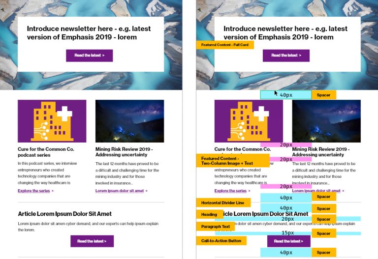
A simple way to ensure that you’re following spacing guidelines is to add up the top + bottom spacing of adjoining elements. If module A and module B are stacked:
- [Module A] – review bottom spacing
- [Module B] – review top spacing
- Total of “bottom spacing” and “top spacing” should equal 40px maximum. Adjust values accordingly. (It does not matter which value you choose to adjust, as long as the total is 40px).
- There should never be more than 40px of spacing between any modules.
Color
Color usage is documented extensively in this guide. a
- Only apply colors as explicitly prescribed. Do not apply color in other ways.
- Do not change the color of headlines or any text.
- Do not change the color of links to anything but #7f35b2 (per standard), and do not use colors that are not on-brand.
Layout
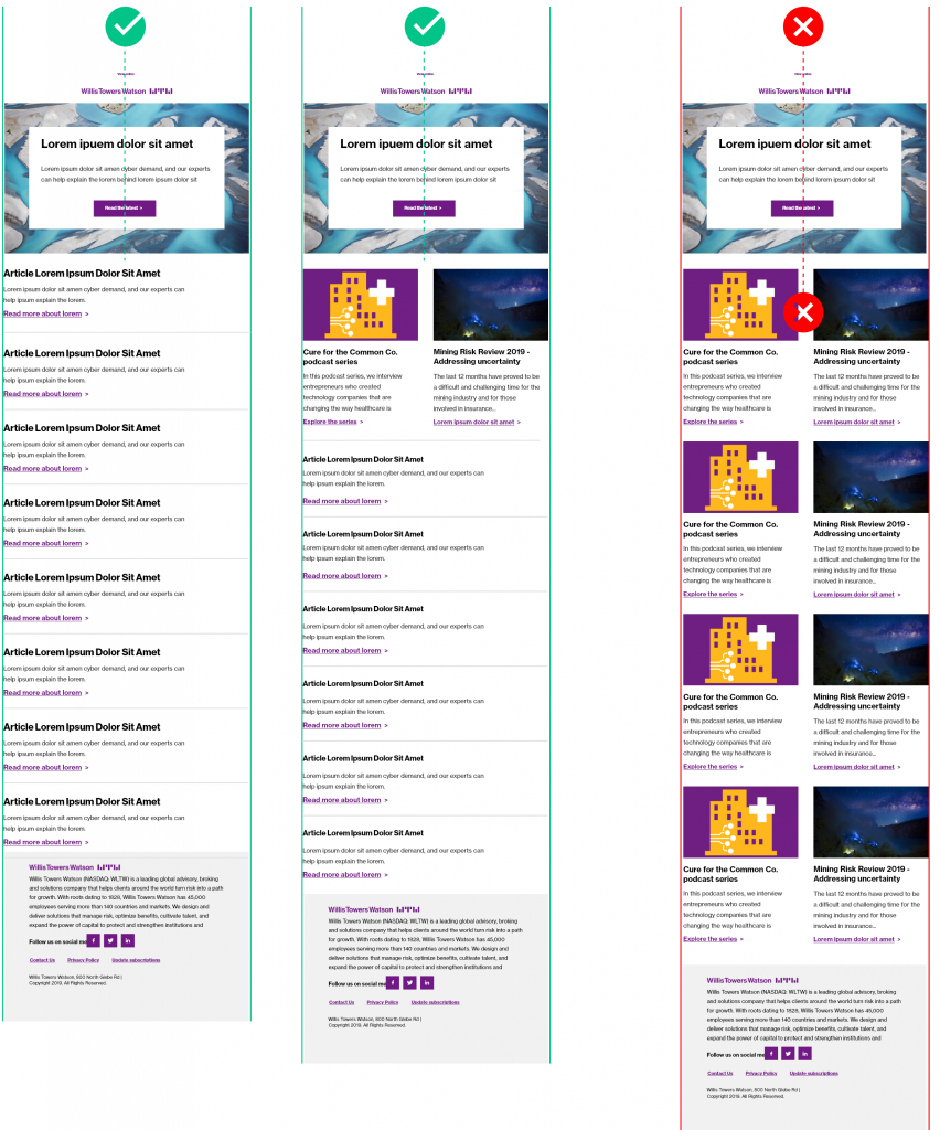
When designing an email, keep in mind that many users will lose interest after 5-9 elements/options to choose from. While this is not a firm rule, keep in mind that your communications should be succinct. The more content you include in your emails, the less likely it is that a user will feel like they are receiving valuable content.
If, for example, you have a newsletter that has 10-12 articles for that month/quarter, consider using text-only options to display the content. That way the “volume” of content seems more digestible to the user – as opposed to providing images for each of the 12 options. Since our images are decorative in nature (e.g. if they were not present, the content is still easily processed by the user), simplification is the best approach.
Take care to use enough negative/white space to allow the user’s eye a chance to rest.
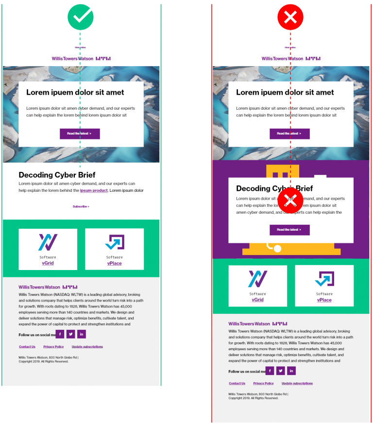
Example: Don’t juxtapose large card elements Try not to juxtapose large card elements, as the visuals could be too strong and could actually create too much clutter. Instead, alternate elements that use background colors and those that don’t, in order to create visual distinction and offer the eye a chance to “rest.”
Example: Break up your content visually, especially if you have 9+ articles. If you have more than 9 articles/pieces of content to feature, either consider sending separate emails, or use less-visually dominant modules.
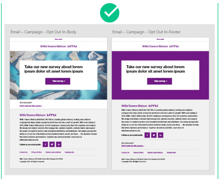
Example: It’s okay to use one singular dominant card in a simple email. If you have only one article to feature, you can break the “65%” rule, and you can have an email that is dominant with a background image. An example of that would be a Survey w/ an opt-out message.
Background Colors
The overall canvas (the area outside of the email body) must always be white (#fff). This is pre-set as a global variable and should not be changed.
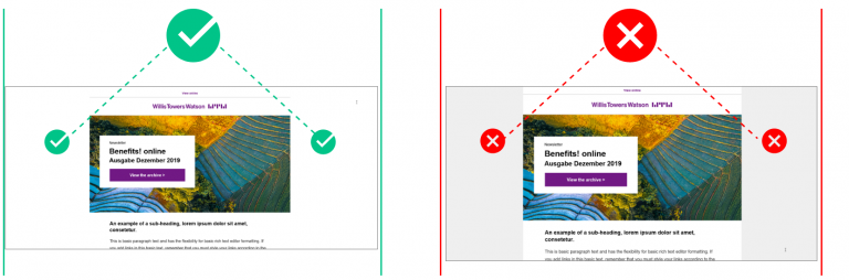
This is not simply a design/branding requirement. This ensures that the email, when forwarded, does not retain a background that makes text harder to read.
You can use background colors within the modules that delineate background color options (e.g. the call-to-action button, full card, half card, and two column w/ icons. You must use them as directed, with the options provided.
Modules
For individual component/module design, reference Email Design Modules.