Primary Links
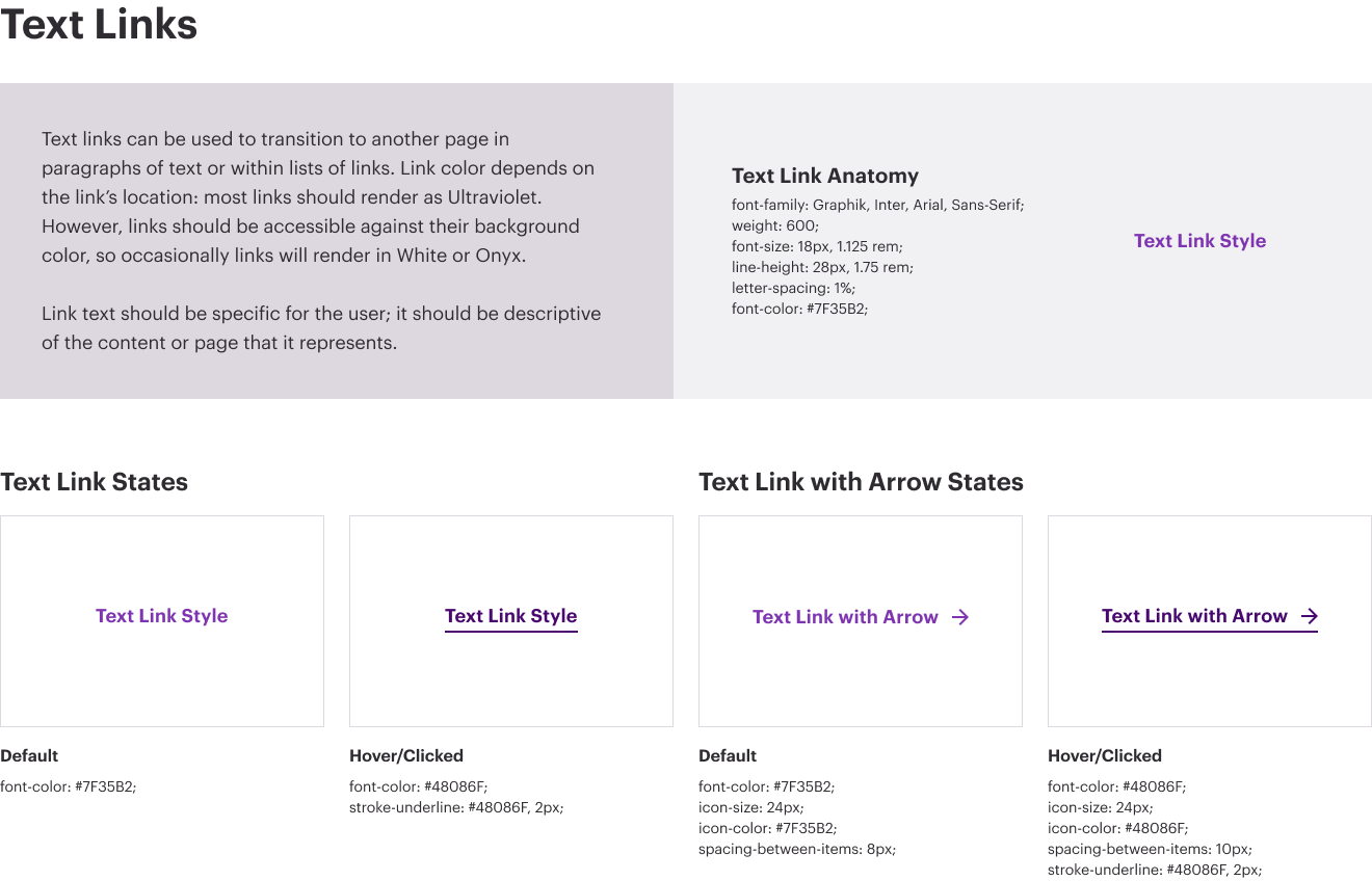
Primary links are used for the title of the articles, solution names, or product names that are linked to their respective pages. For instance, the related service content matrix titles of the service names linked are primary links. The titles in the related content, such as the article titles, are standard links.
Secondary Links
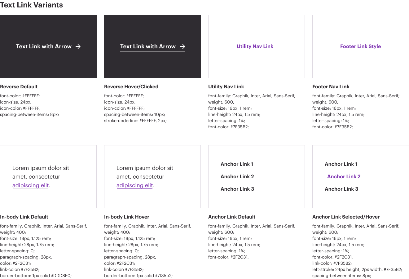
Secondary links are also link styles that are violet, but that are in the context of a paragraph. Secondary links do not have a caret and upon hover the color will change to darker violet and an underline will appear. Secondary links within copy are violet with a gray 1px underline. Upon hover the violet turns to the darker violet and the underline increases to 2px.
One example of a secondary link may occur in a paragraph as an in-body link.
Eyebrow Links
Eyebrow links and text are informative. Think of them as “nouns” that define the type of content that is being featured. Examples include – “HR Software”, “Product,” “Article”, “Featured Video”. These tags are things that define the type of content. They are not “subjective” or something outside a standard description.
For example, eyebrow tags should not be names, dates, locations, etc.
Some modules that include eyebrow tags (this list is not exhaustive, but shows how this is across atoms, molecules, organisms…):
- Featured Callout
- Featured Content
- Content Matrix – Small – Right Rail
- Call to Action Module
Call to Action Links
Call-To-Action (CTA) buttons are used to draw attention to actions that are not the primary intent of that page. CTA buttons are used in “See All Insights” in the Related Insights Card module. CTAs can also be leveraged to let users read more in-depth on the featured content cards in the featured content modules. CTA buttons are violet text, with copy that makes it clear to the user what action will be performed, along with a violet caret. Upon hover, buttons turn to a dark violet and the caret animates, shifting 10px to the right.

