Dropdowns are toggleable, contextual overlays for displaying lists of content, list of links, and more. By design for multi-device support, dropdowns are toggled by clicking.

Most effective when there are fewer than 15 options to select from. If there are five items or less consider a more contained dropdown experience like a “sort.”

Sometimes a long list is unavoidable, as found within Contact Us where there are many countries to choose from.
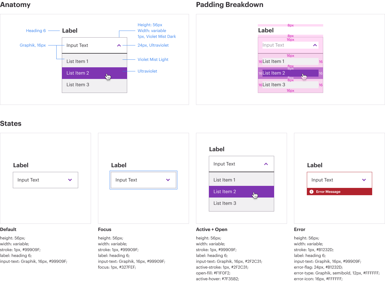
Dropdowns

<div class="btn-group">
    <button type="button" class="btn btn-lg btn-outline-primary dropdown-toggle" data-toggle="dropdown" aria-haspopup="true" aria-expanded="false">
        Dropdown
    </button>
    <div class="dropdown-menu">
        <a class="dropdown-item" href="#" aria-label="">Lorem ipsum dropdown title</a>
        <div class="dropdown-divider"></div>
        <a class="dropdown-item" href="#" aria-label="Link, click to read Lorem ipsum first survey in the report">Lorem ipsum first survey in the report</a>
        <a class="dropdown-item" href="#" aria-label="Second ipsum survey in the report second ipsum survey in the report second ipsum survey in the report">Second ipsum survey in the report second ipsum survey in the report second ipsum survey in the report</a>
        <a class="dropdown-item" href="#" aria-label="Link, click to read...">Something else here</a>
        <a class="dropdown-item" href="#" aria-label="Link, click to read...">Lorem ipsum first survey in the report</a>
        <a class="dropdown-item" href="#" aria-label="Link, click to read...">Second ipsum survey in the report econd ipsum survey in the report econd ipsum survey in the report</a>
        <a class="dropdown-item" href="#" aria-label="Link, click to read...">Something else here</a>
    </div>
</div>

If the background of the page is darker, use a white background for the dropdown.

Dropdowns must be accessible and must pass criteria from WCAG 2.1 AA.

No content for this section.