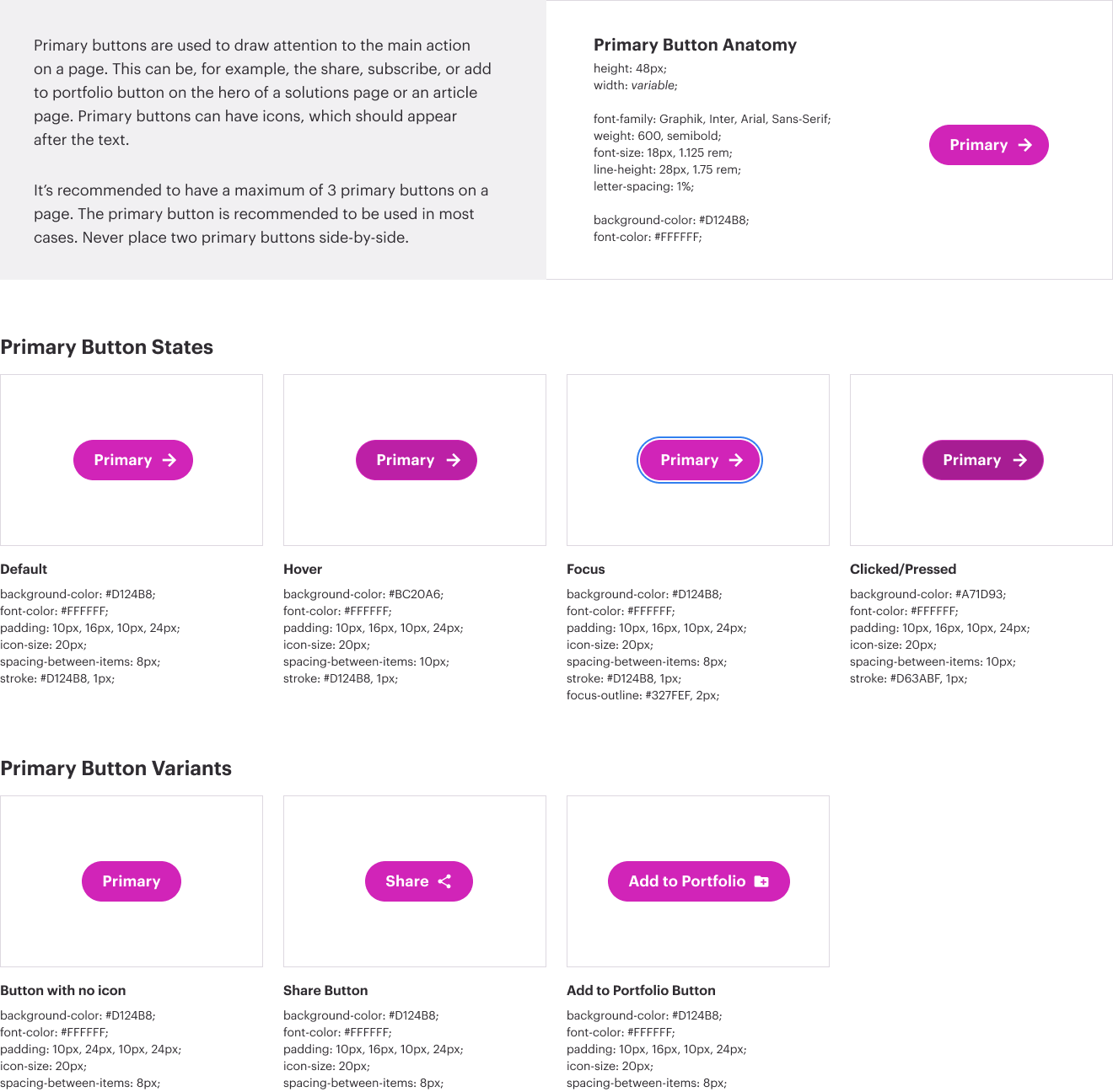
Primary buttons are used to draw attention to the main action on a page. This can be, for example, the share, subscribe, or add to portfolio button on the hero of a solutions page or an article page, as well as the login button on a full-width product module. Primary buttons can have icons, which should appear after the text. It’s recommended to have a maximum of 3 primary buttons on a page. The violet primary button is recommended to be used in most cases. However, in certain instances, if the background color doesn’t give enough contrast to the primary button, use a white background primary button. Never place two primary button side-by-side that have the same visual treatment.
Remember to add in the proper aria-label and aria-hidden values for elements of each button. The text is important but may not have enough information for users; for instance, does “Subscribe” tell the user what they are subscribing to, or where? And isn’t the right caret more decorative than anything? Since the right caret does not enhance anything but the visual experience, we can ask the screen readers to hide the element from their analysis for optimized accessibility.
Secondary buttons are actions secondary to the primary button such as ‘Cancel’,‘Close’, or ‘X’. The visual treatment for these buttons is predicated by the primary button styling. Examples of secondary buttons include Homepage Right Panel, Filters, and Navigation.
Remember to add in the proper aria-label and aria-hidden values for elements of each button. The text is important but may not have enough information for users; for instance, does “Subscribe” tell the user what they are subscribing to, or where? And isn’t the right caret more decorative than anything? Since the right caret does not enhance anything but the visual experience, we can ask the screen readers to hide the element from their analysis for optimized accessibility.