Icons are an essential part of many user interfaces, visually expressing objects, actions and ideas. Functional icons symbolize common actions, files, devices, and other UI elements that are otherwise not a part of the content.
Functional icons can be used to provide visual affordance for potential interactions on a website (e.g. menu, chevrons, close buttons).
Icon Library
The preferred icon library is Google Material Symbols.
Design and developer resources:
- Material Symbols Developer Guide
- Introducing Material Symbols
- Material Symbols on Google Fonts
- Material Symbols - Figma Plugin
- Material Symbols - Github Repo
The WTW brand configuration of Material Symbols is as follows:
| Option | Value |
|---|---|
| Weight | 600 |
| Outlined | Yes |
| Filled | Yes |
Design Intent
Functional icons are pulled from Google Material Symbols with parameters of: 600 weight, outlined, and filled. Either outlined or filled As the name implies, they are used for functional interactions on our website (e.g. menu, chevrons, close buttons) and are not to be used decoratively in content body. These icons display across our atomic design system to improve affordance and usability. Functional icons should be styled with a single color depending on the background they are placed on. Ultraviolet is the primary icon color, while White is used on backgrounds with color.
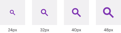
Icons sizing can changes based on placement (with or without text) and should be able to scale easily using the sizes below that are based on the 8pt grid. Minimum size should be 24px, which is the default size across the system. The maximum size should be 48px.
Clickable icons need an area of at least 48px so that users can interact with them. This includes the icon and spacing around the icon. Padding may also be used with or without a background fill.
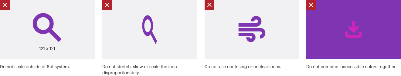
The following examples demonstrate show how icons should not be used. Consistent use of the icons will help ensure a consistent look throughout the website.