Dividers And Spacers
Horizontal Divider Line
Overview
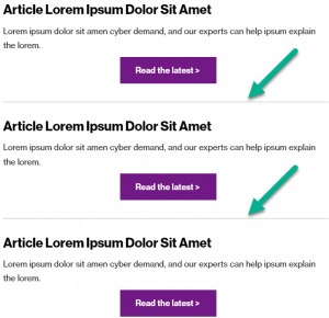
A divider line is a subtle way to provide delineation to content, and helps “segment” content in a way that improves legibility.
Visual
Specs
Divider lines have the following properties:
- 2px tall
- #d8d8d8 in color (no other colors allowed)
- Generally have 40px spacing on top and 40px spacing on bottom when used (see below)
- Span the full-width of the main content column (640px) – not the full width of the entire email.
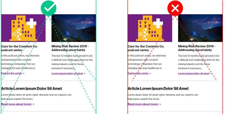
See in the below example, where a divider line is used to segment content in a neat, clean way, with adequate spacing above and below the horizontal divider line.
Usage notes
Do not use a horizontal line to divide any modules that have a solid, full-width background image. Instead, use a spacer to achieve good distance between modules with full-width background images.
Do not modify the width of divider lines so that they are inside or outside of the content blocks. Ensure that the left part of the line aligns with the left modules above and below, and ensure that the right part of the line aligns with the right modules above and below. If using Marketo, the line is pre-set at “80” and this is the correct configuration. Even if the preview mode looks different, the line is configured properly.
Marketo module configuration
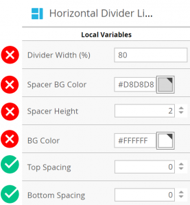
Below are the default values for the Horizontal Divider Line module.
You may modify these variables if needed, to achieve proper spacing between the divider line and other content. Remember to adhere to spacing guidelines.
- Top Spacing
- Bottom Spacing
You may not modify these variables:
- Divider Width
- Spacer BG Color
- Spacer Height
- BG Color
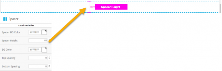
Spacer
Overview
A spacer is the vertical, negative space (“white space”) between modules or elements. It is useful to provide distinction between elements and to allow breathing room. It is configurable to any space amount in pixels, but should follow specifications stated below.
Spacing vs spacer
Spacing refers to the cumulative amount of space between modules to create the proper space. A spacer is the element you can use to easily add the appropriate amount of space without diving into the variables of each element. Spacers are also helpful to use above and below horizontal divider lines to configure the appropriate amount of space.
Visual

Specs
These specifications are a cumulative amount of spacing. This does not mean that a spacer gets added between each module. This means that you must ensure that the cumulative space between elements is a certain height.
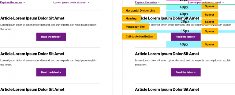
Generally, display 40px of white space total between major elements.
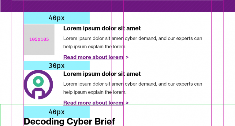
Display 20px or 30px of spacing between elements of similar categorization.
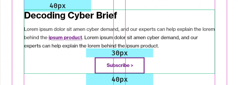
Only use spacers the following increments, assuming the top and bottom value of modules/elements it is being placed in between is zero:
- 10px
- 15px
- 20px
- 30px
- 40px
In the example below, note the build of a series of components. Yellow denotes Marketo modules, blue denotes spacer distance, and magenta denotes space incorporated within a module. On the left, the design. On the right, the design as constructed with Marketo modules and spaces.

Usage notes
Potential uses:
- Simple way to divide content, especially between two Horizontal Divider Lines
- Easy click and drag spacer without toggling variables in each Marketo module
Marketo module configuration
Add a spacer to the canvas. Update the Spacer Height variable per spacing needed.