Three Col Icon And Text
Three-Column Text + Image
Overview
This is a three-column layout suitable for icons to entice interest and intrigue. This is not intended for featured intellectual capital.
Visual
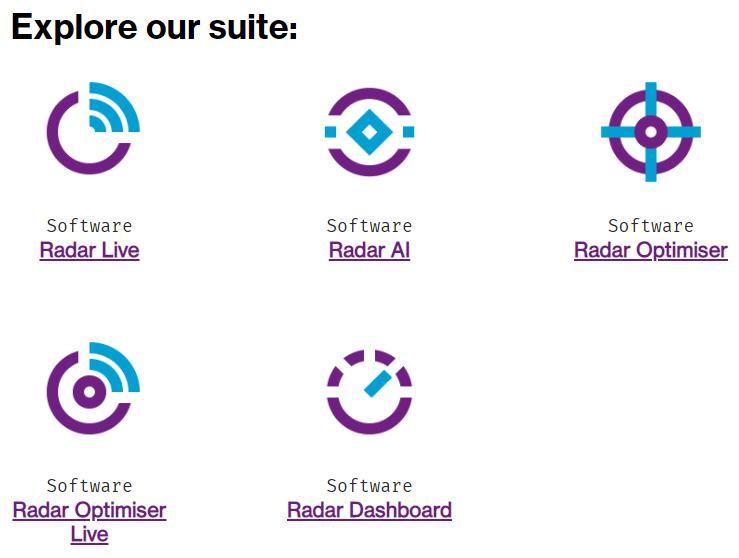
Example, single three-column w/ icons from the WTW Web Icon Library icons:

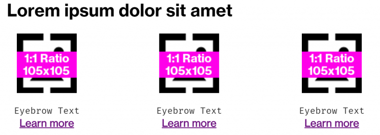
Example, multiple three-column modules in a row, to create a series of 5 icons. (Note that the second module had the Heading Text replaced with a Blank Snippet, and the top padding was removed from the second module as well).
Specs
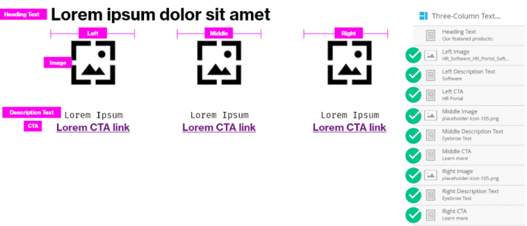
Marketo module beginning layout:
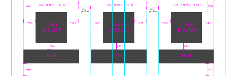
Detailed visual specs:
Variations of usage for text (note the opportunity to use the Fira Mono font to format eyebrow text) – do not mix and match.
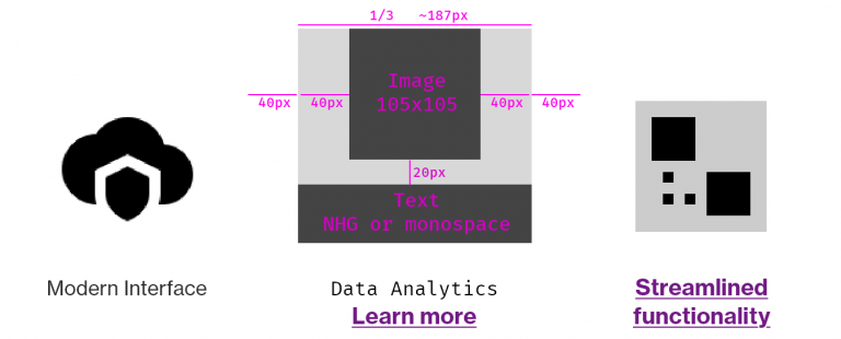
Elements: - Heading text – optional – - Color: #000000 - Font- family and weight: Neue Haas Grotesk Bold 75 (or location-specific font) - Image – mandatory – must be on-brand and 1:1 icon (not photography) - Description Text – optional, default is Fira Mono (simulating an Eyebrow Tag) - CTA – optional, but should likely be present if description text is not used
Usage notes
Use only square 1:1 ratio, 105×105 px icons. Do not use brand photography.
Do not implement different text styles in the modules. Be consistent. If you are using the eyebrow text and CTA link, use that treatment for all three icons. No mixing of formats.
Icons must be 1:1 ratio and created at 105px x 105px
This is useful for featuring 3-across, but can be combined with additional, identical modules to display 5, 6, etc. Do not use this for only two items. (e.g. if you need to display 2 items, and not three, consider using two of the Icon + Text (small) modules).
You could consider using this to feature speakers or bios instead of the Featured Callout + Text module. In this case, photography (JPG) is allowed for the person’s headshot, but must be kept to a 1:1 ratio and 105×105 px.
Marketo module configuration
- Update the heading text by double-clicking the element, or remove it entirely by replacing with a blank snippet
- There should be no need to update any other variables unless you are stacking multiple of these modules, in which case you can remove the top spacing from the second module in order to keep proper overall spacing between elements.
- Use proper link formatting to ensure that the content renders properly if using a link
Video: Updating the Three Column Text + Image module in Marketo