Usage Notes
- Use only for tabular data, not for formatting content like lists or for layout
- Use proper HTML for tables, including headers, captions, and semantically proper HTML
- Use variations (Bootstrap classes) to modify – e.g. create striped backgrounds, use condensed version
Review these table best practices from MDN before getting started: Mozilla Developer Network Tables
Generating Tables
Creating tables with a lot of data can be time-consuming, but it is worth it given that imagery does not adequately provide usability or accessibility for tabular data.
For complex tables, it’s recommended to use a table generator, like this: Tables Generator – where you can add data and simply check the box “do not export CSS.” Then, use the HTML snippets below (specifically the wrapper classes) to add tables to your content.
Or, for simple tables, use a basic CMS editor and add specific classes accordingly.
Simple Tables (Responsive)
Note the class=”table” that is on the table element. Tables span to the width of the container they are placed in. Therefore if you need to display a full-width table, ensure that it is placed within a full-width container.
Also note that the below code snippet is wrapped in a “table-responsive” container to allow for any content to horizontally scroll if it is too wide. If you’d like to disable this, just remove that wrapper class.
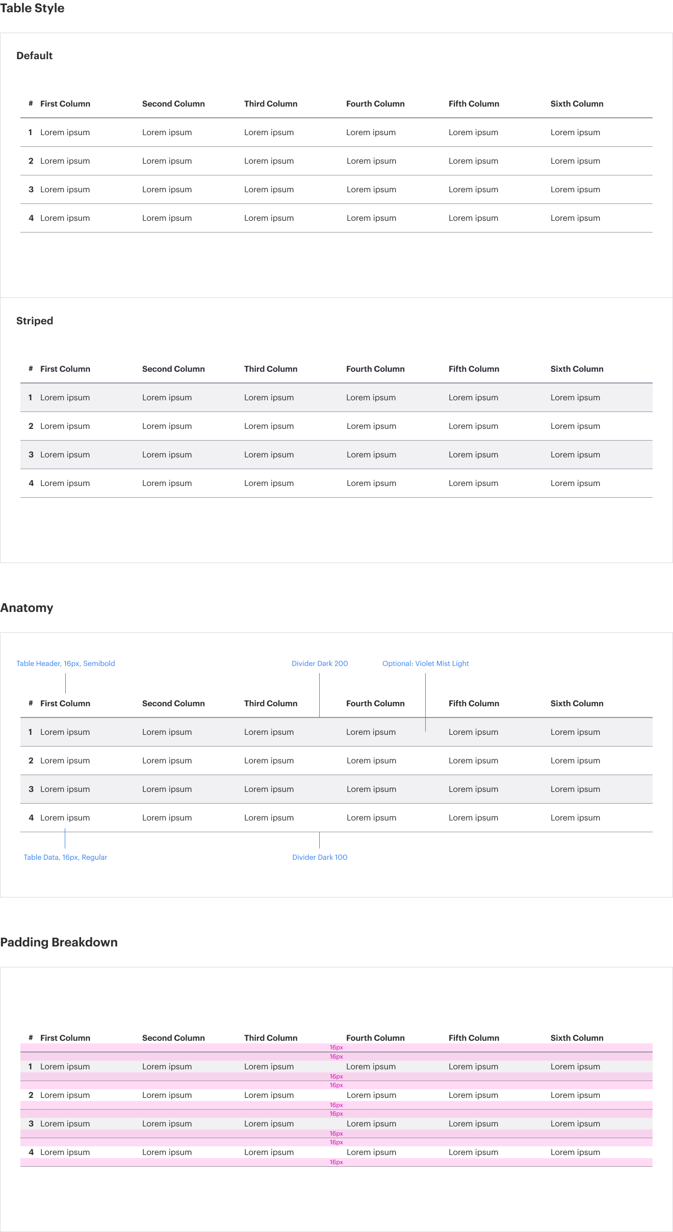
Each table must have specific information that helps users and screen readers. Each table must have the following components:
- Title - (associated with the table, typically a
<h4> or similar depending on where the table is located in the content structure) – appears above the table and is for visual users to set context.
- Caption –
<caption> (within the <table> itself) – in code, appears just after <table> but displays visually underneath the table. Often is a duplicate or similar to the title of the table.
“The caption is meant to contain a description of the table contents. This is useful for all readers wishing to get a quick idea of whether the table is useful to them as they scan the page, but particularly for blind users. Rather than have a screenreader read out the contents of many cells just to find out what the table is about, he or she can rely on a caption and then decide whether or not to read the table in greater detail.” – MDN Advanced Tables
- Table Headers –
<th> elements within a <thead> denoting what each of the columns represent.
Combining table styles
You can combine these table styles. For example, a have a striped, condensed, responsive table:
<div class="table-responsive">
<table class="table table-sm table-striped">
</table>
</div>
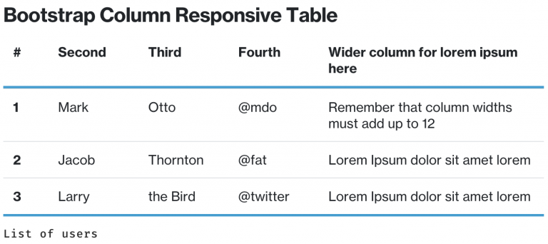
Assigning Table Column Widths – Bootstrap Columns
On WTW, thge Bootstrap-preferred way to assign widths (instead of allowing automatic resizing of column widths, as seen in examples below) is to use the Bootstrap class d-flex on the <tr> elements. Then, assign column widths using the Bootstrap grid system. In a grid system, all columns must add up to 12. In the example below, for instance, add up all of the item column numbers (where you see “col-md-1″…) within the <td> of a standalone <tr> tag – you will see that it equals 12.
Assigning Table Column Widths – Percentage-Based Columns
Sometimes, the data needs to be fine-tuned and 12 columns are “too wide” to present the data. For instance, in a data-heavy table, you may have more that 12 columns. Since Bootstrap doesn’t accommodate “half columns”, and content editors usually want control over the width of columns, you may use percentage-based width style attributes. Do not use pixel-based attributes as this will break our responsive design.
In the example below, the percentage values of the columns must add up to 100%. Feel free to add/delete columns and configure the widths as needed. Keep the classes – the d-flex class is needed on the <tr> tags in order to manipulate the width of Bootstrap tables.

Other configurations are possible using Bootstrap 4 configurations. For example, adding borders if needed. (The exception, as always is color: do not add other colors to your tables)
- Use standard HTML to span columns, span rows, and structure your HTML table and tags as-needed. A table must be structured to support the data that it is communicating.
- Do not place content in a table for visual design purposes/ content must be tabular data-only. Tables must have tabular data, and must have proper table header code. In the example below, a list of countries is displayed in a table. This doesn’t make sense to a screenreader – this is a simple list of countries and should either use an ordered or unordered list. Use Bootstrap column formatting classes if you need to display content in two columns.
- Only use a table if a matrix is needed to convey information, otherwise consider an unordered list.