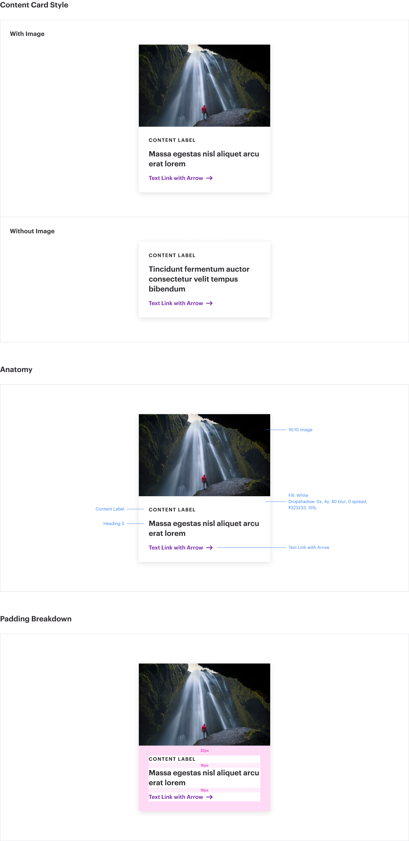
Cards are vertical, rectangular containers used for displaying content. They provide a clear way to display additional content to the user. The entire card is clickable for the user, allowing a user to both tap (mobile) and click (desktop) the item.
Cards contain a non-clickable tag, using Fira Mono typeface, to provide context to the user about the type of content the card represents.
Cards also contain a clickable headline which displays in WTW Digital Violet.
Cards are flexible and may contain a photo if desired. If no photo is used it is recommended to include sub-copy in the module to keep a visual balance with the other cards that may have photos.
Imagery should be associated with the content that is being highlighted in the card. For example, if the card is featuring an article, use the hero image from that article to create a consistent branded experience. On wtwco.com, much of this is automated within the CMS.
If there is no apparent featured image on the content page, use the text-only card option.