Standards
WTW external emails should be closely aligned with our overall style guide. This reference guide explains design decisions for email based on the overall digital design system, and provides specific guidance for platform-based email design.
Our digital design system is extended into the email ecosystem with careful consideration of devices, viewports, and standards. With email, given that there are an enormous amount of email clients (Gmail, Outlook, Yahoo, Apple, etc) there are different email client standards for coding than our overall digital design system.
- Email Modular Design
- Module Customization
- Structural Specifications
- Email Responsive Design
- Accessibility within Email
Email Modular Design
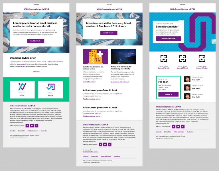
As with our overall digital design system, we design emails in a modular fashion. Modules can be stacked on top of each other in a configuration that makes sense for the specific messages being distributed.
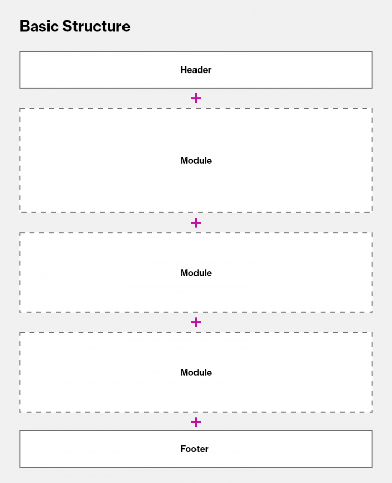
Each email must always have:
- Header – includes branding, such as a logo, and “View Online” component
- Body (modules) – includes a variety of options
- Footer: Footer design is based on branding requirements, legal requirements, and privacy requirements for specific locations. Each email must follow all overall accessibility standards, including and especially for imagery. The email digital design system and the module standards have already taken accessibility into account. Therefore, it is important to review all standards and adhere to guidance when creating emails. Do not deviate from the guidance.
Each email must follow all overall accessibility standards, including and especially for imagery. The email digital design systemand the module standards have already taken accessibility into account. Therefore, it is important to review all standards and adhere to guidance when creating emails. Do not deviate from the guidance.
Modules can be repeated, removed, updated, and used differently depending on needs.
Our basic structure is a single-column modular layout. All modules are stacked in a “sandwich” type format. Do not think of your emails in columns – think of them as a linear stack of content that is important to users. Some modules have a semblance of “columns” but really are singular stacked elements.
We create the effect of “columns” by using stackable modules with columns inside them. All modules are designed with flexibility for tablet and mobile display.
Module Customization
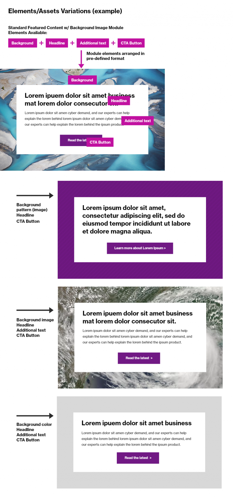
Modules are designed to be reused based on needs. Content (text, fonts, and images) can be changed. Each module has the ability to be modified to contain appropriate content while properly representing the WTW Primary Brand. All allowed configurations are noted within the email design modules page.
For example, in a standard module (such as the Full Card – Featured Content) that includes a background image, headline, additional text, and a CTA button, the following options could be created:
Structural Specifications
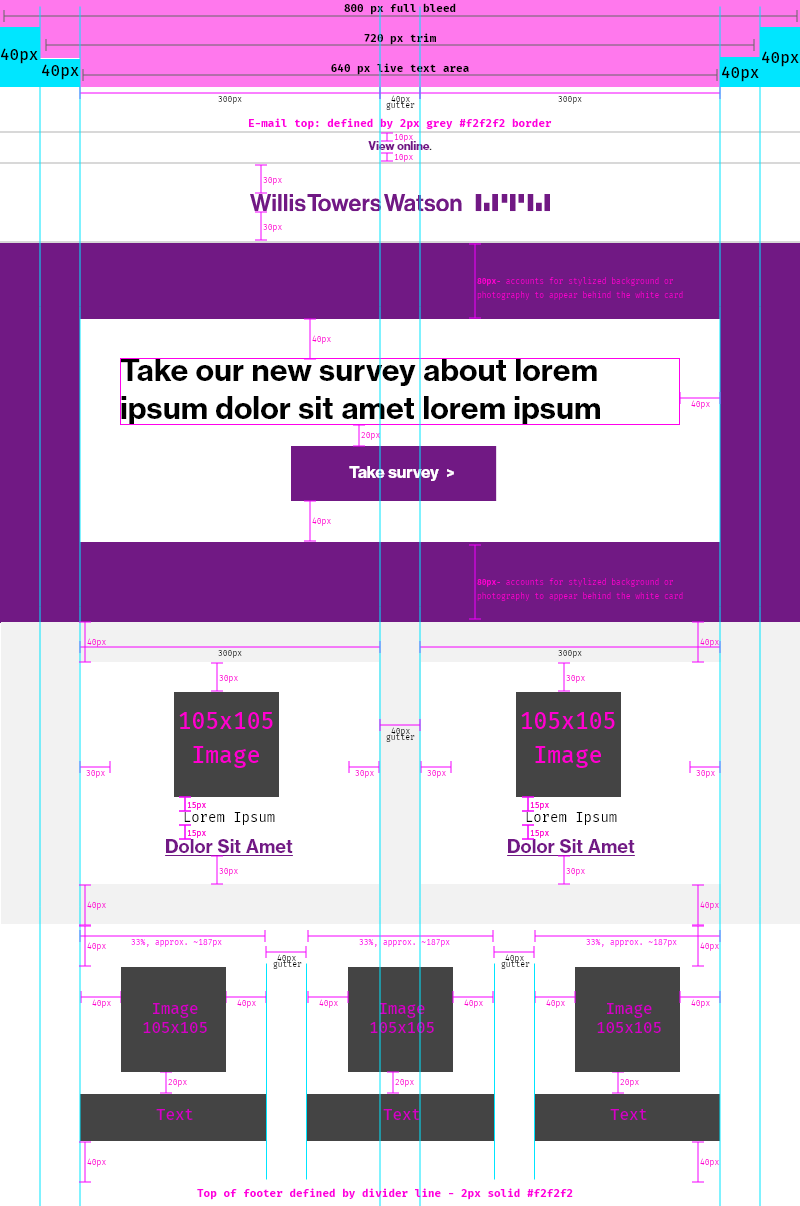
We design for desktop/tablet and mobile email display. General best-practice includes keeping text and main content within a 640 pixel container to support most/all email clients.
Desktop/Tablet
On desktop/tablet, the following specifications apply:
- 800px container “full bleed” – e.g. background imagery and colors will expand to this 800px container. No contents should exceed this 800px container.
- 720px “trim” area
- 640px Main Column Live Text Area – all modules vertically align & center within this area. Main content all renders within the 640px container.
- “Two-column” – a few modules have a two-column appearance; each column is 300px wide with a 40px gutter. These are not actually columns. These are single modules divided into even content blocks.
- “Three-column” – one module has a three-column appearance; in this case, each “column” is approximately 187px. Each column is about 1/3 of that main column with a 40px gutter between. These are not actually columns. These are single modules divided into even content blocks.
- Margins/padding – 40px is a standard for outside borders. Inside card borders are occasionally 30px. See Spacers for standard best-practice.
When you are designing your e-mail, remember the following:
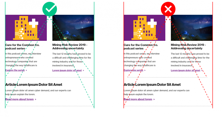
- Content (including imagery) should be flush left and right, and divider lines must align with the content to create a “line of good continuation” – do not indent horizontal divider lines.
- Keep font sizes consistent
- Use a consistent, branded treatment for links
Email Responsive Design
Always consider how e-mails will render across different devices. We design for mobile-equal – all of our modules and assets should respect the concept of displaying on a smaller screen. We try to accommodate for this by providing responsive modules that place text separately from imagery so that it can responsively adapt to the device it is displaying on.
This means we need to be particularly careful with imagery. Why?
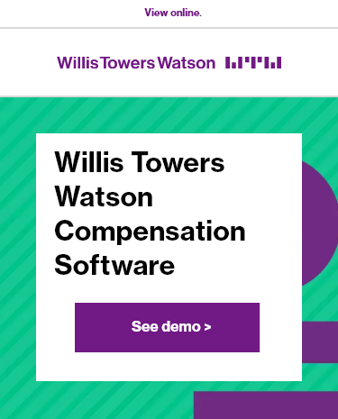
Below, see an example of a basic email with a hypothetical image banner. In this scenario, the text has been placed on top of the image and is a part of the image file.

When this image is placed in an email template into the image module, it looks fine in desktop.
However, when this email is opened in a mobile format, the image banner has scaled much smaller to fit the new width. Now, the text size is much smaller, even smaller than our minimum email font size. This isn’t an ideal experience. This will create issues for accessibility and email clients (since the title of the email is embedded within an image).
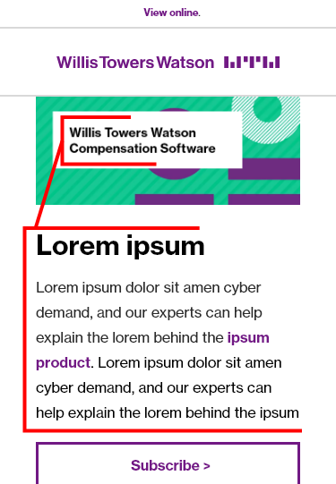
Additionally, note that the text in the banner cannot be read by screen readers and therefore relies on proper alt tag information. If this is not entered, non-sighted users will not be able to perceive all of your content.
A better solution, and one that fits with our responsive design framework, would be to use a module that allows the text to display on top of an image – in HTML format, easily edited and updated. As you can see below, the Half Card – Featured Content text displays on top of the image (with a helpful call to action button!) and responsively scales/re-orders in mobile display. In this instance, a standard image (16:10 ratio, at 800×500) is scaled and reused across the different viewports.
Desktop:
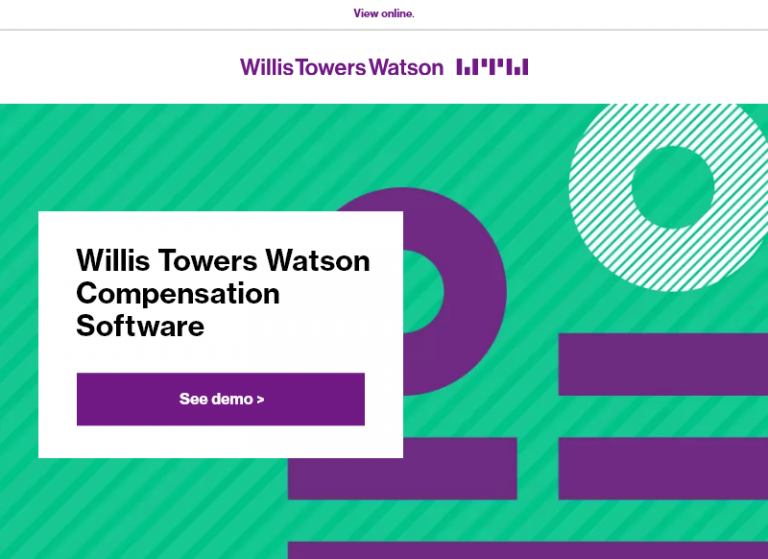
Mobile:
Accessibility within Email
As usual, within our digital elements, we are concerned about accessibility. Most of our imagery within emails are decorative – which means that what they are is irrelevant to a non-sighted user. They’re mostly for visual branding and aesthetics.
Refer to: