Design Modules
This documents Marketo modules. Designs for other email clients must leverage this design system as best possible.
This documentation is specific to Marketo email marketing modules. Other email marketing systems must leverage this design system and apply it as best possible.
Remember to review the Email Digital Design System guidelines before proceeding with module guidelines.
Use the table of contents below to quickly jump to a specific module.
Table of Contents
- Link color
- Background color
Header
Content Modules
- Bullets
- Call-to-Action Button
- Featured Callout + Text
- Featured Content – Two-Column Image + Text
- Full Card – Featured Content
- Half-Card – Featured Content
- Heading
- Horizontal Divider Line
- Icon/Image + Text (Small)
- Image
- Paragraph (Rich Text)
- Spacer
- Subheading
- Three-Column Text + Image
- Two-Column Cards w/ Icons
- Two-Column Featured Content and CTA Button
- Two-Column Image + Text (Left/Right)
Other elements (non-modules) or instructions
- CTA Chevron and Link Styling – HTML code for call to action links with chevron > and for regular links within the Marketo Email Editor
- Table Styling – in the Marketo Email Editor
- Blank Snippet – when choosing not to use optional elements of a module
- Updating the font family – to reflect local font requirements
- “Removing” an image from a module – the trick in Marketo to replace a 16:10 or a 1:1 image with “nothing” – e.g. a thin, transparent placeholder
- Adding background images in background image modules – how to correctly size/implement background images with variable amounts of text
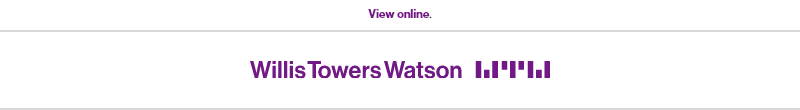
View Online
Mandatory Component
This module always displays at the top of an email, above the logo component. It allows someone to view the email in a browser vs. viewing it in their email client.
Visual

Specs

- There must always be a 2px #d8d8d8 solid divider line at the bottom of the component, between this component and the standard header (with logo).
- Font usage is based on culture font requirements. Default is Neue Haas Grotesk Bold.
- Link must display in #7f35b2 color
- 10px of clear space padding must be above and below the link
- Do not change the background color of this module.
Usage notes
- This is controlled using a Marketo snippet, which means that it is controlled by the corporate digital marketing team.
Marketo module configuration
The only configurable option within this module is selecting the correct snippet for the region/location of the email.
Click the settings gear on the module:

Select the proper snippet for your email:

Header – WTW Standard
Mandatory Component - or use co-branded option
Overview
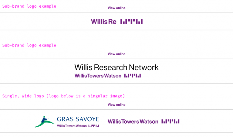
The header is where we establish branding for the email. It can be a master brand logo or an approved sub-brand logo – contact Katie Cisto, Steve Bottjer, and Molly Fisher for sub-brand logo questions or requests.
Visual
The standard header is a WTW master brand logo. The logo is centered horizontally. We use 30px of padding on the top and bottom for the standard WTW logo.

We can also replace the main logo with a sub-brand or alternate master brand logo.
Specs
- Logo must be optimized for e-mail display
- Logo max width – 500px
- Logo max height – 100px
Usage notes
- This is controlled via a Marketo snippet by the corporate digital marketing team.
- Subbrand logos must be approved for use by the global brand team.
Marketo configuration
Click the gear to change the snippet.

Select your correct snippet based on your email needs.
Video: Replacing the default WTW logo with an approved subbrand logo
Header Co-branded
Overview
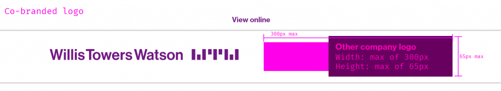
This header provides the option to combine a WTW logo with a co-brand logo.
Visual
Specs
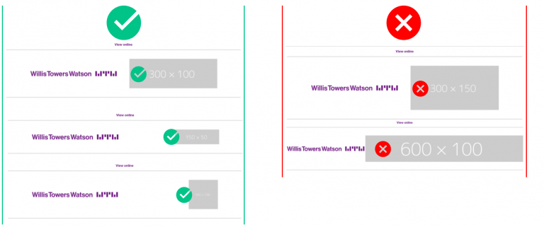
Co-branded logo should be an absolute maximum of 300px height and a suggested maximum width of 65px. The reason we have not established a definitive height is that some logos require a bit more height (e.g. square ones). As this is being set up, keep in mind that the logos should be around the same visual “weight” – meaning one does not dominate the other in size or shape – and is absolutely smaller than 300px wide.
This does not mean that your logo needs to be sized to 300×65. This means that your logo should fit within those dimensions.
For example, the following logo dimensions would be usable:
✓ 100×100 ✓ 150×150
And the following logo dimension would not be usable:
× 300×150: this is because the visual weight of the co-branded logo is huge in comparison to the WTW logo, and it does not look balanced. × 600×100: this is because the width exceeds the absolute maximum and this does not look good.
Usage notes
The left side of the co-branded module – the WTW logo – is controlled in a Marketo snippet. It can be swapped with another element of the WTW Master or sub-brands that are snippets. That element must be approved by the global brand team and must already be in the Logo library.
Always receive permission to use the logo of the company, vendor, etc whose identity you are placing in the right side of the module. Never use an image asset without consent and permission from the appropriate parties.
Marketo module configuration
Add the module to your canvas, and double-click the co-branded image slot. Select your logo within the Design Studio, and swap the image appropriately.
Video: Updating the co-branded logo
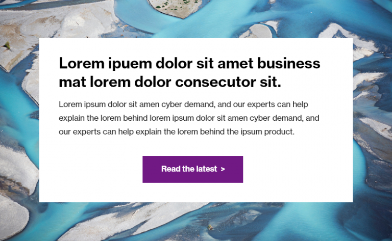
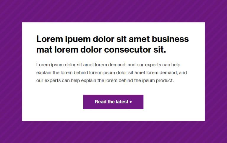
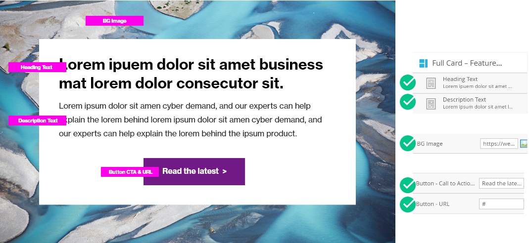
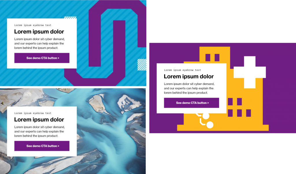
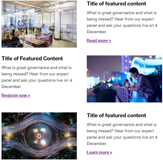
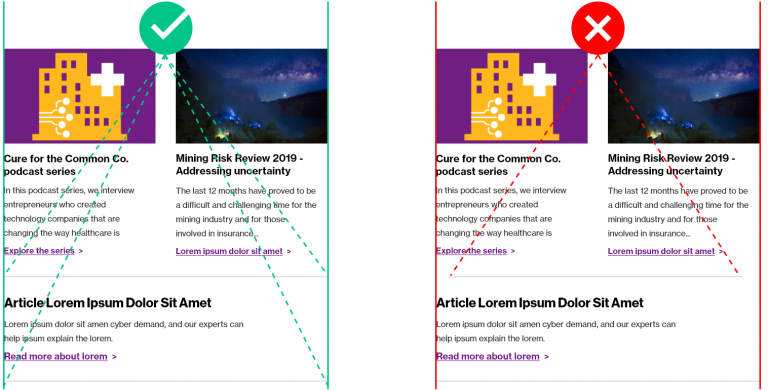
Full Card – Featured Content
Overview
This is a dominant, bold module that leverages a background image, typography, and a call-to-action button to present content. It is recommended not to use more than one of these per email.
Visual
Using a brand photography image:
Using a pattern background image:
Specs
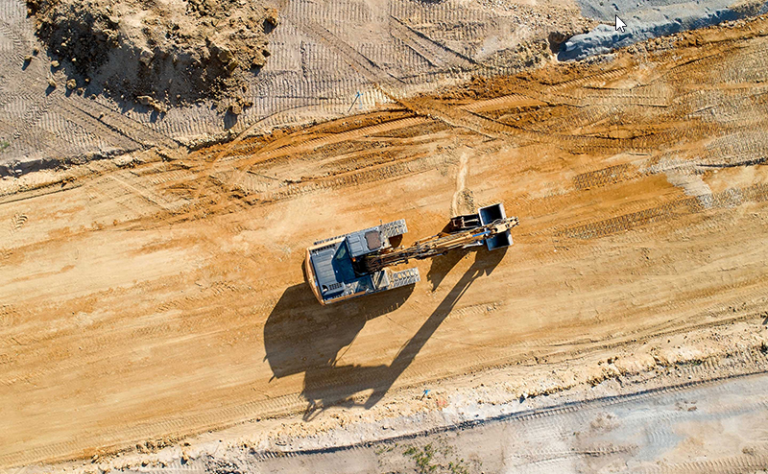
- BG Image – mandatory – must be 16:10 ratio. (See Email Digital Design System > Imagery) Options include:
- Brand photography: choose from the Image Library: Images > Brand Photography
- Bespoke illustration: this must be brand-approved and follow all guidelines. Examples include a featured podcast branded illustration, a COVID-19 topic featured image, or a Software Product Banner.
- Generic background color: choose from the pre-approved Marketo Image Library:
Images > Backgrounds and Patterns
- Heading text – mandatory –
- Color: #000000
- Font-size:
- Font-family & weight: Neue Haas Grostesk Bold 75 or (or location-specific font)
- Do not display as Fira Mono.
- Use reasonable character length (60 characters or less), or select a different module to accommodate your content. Should not be a sentence. Can be the title of an article.
- Description text – optional – Neue Haas Grotesk Roman 55 (or location-specific font)
- Button – optional –
- If using, must contain call to action text and a URL.
- If using a button, do not use “click here” terminology.
Usage notes
- The mandatory elements are a headline, background image, and a call-to-action button.
- Headline – font can be customized per local language requirements; always displays as black
- Paragraph text – optional; however, if you don’t have paragraph text, consider using the Half-Card Featured Content module and using the allotted text space for your headline.
- Call-to-action button – ensure you keep the space and the right-facing arrow > for calls to action. Do not remove the >
- Ensure that padding is updated given content that is added to match the specs provided above.
- If your text / button elements are less than 500px tall plus the relative padding, your image will be cropped from the bottom (not skewed/squished). If your image is missing key visual components because you have less text, either add more text or use a designer to create a different image.
Marketo module configuration
Update the items above using the elements in Marketo. View video below for live example.
The other variables within this module are for design configuration and should not be changed.
If you would like to remove an element – e.g. the Description Text – replace with a Blank Snippet as per the linked instructions.
Video: How to use and modify a Full Card – Featured Content Module
Video: Full Card – Featured Content Module – replacing with a Blank Snippet
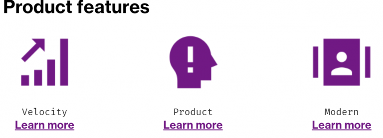
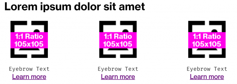
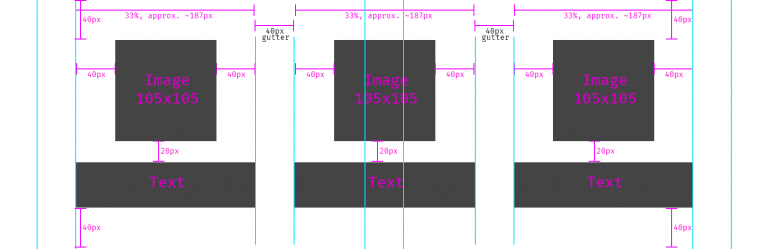
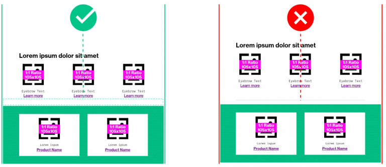
Three-Column Text + Image
Overview
This is a three-column layout suitable for icons to entice interest and intrigue. This is not intended for featured intellectual capital.
Visual
Example, single three-column w/ icons from the WTW Web Icon Library icons:
Example, multiple three-column modules in a row, to create a series of 5 icons. (Note that the second module had the Heading Text replaced with a Blank Snippet, and the top padding was removed from the second module as well).
Specs
Marketo module beginning layout:
Detailed visual specs:
Variations of usage for text (note the opportunity to use the Fira Mono font to format eyebrow text) – do not mix and match.
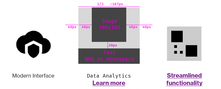
Elements: - Heading text – optional – - Color: #000000 - Font- family and weight: Neue Haas Grotesk Bold 75 (or location-specific font) - Image – mandatory – must be on-brand and 1:1 icon (not photography) - Description Text – optional, default is Fira Mono (simulating an Eyebrow Tag) - CTA – optional, but should likely be present if description text is not used
Usage notes
Use only square 1:1 ratio, 105×105 px icons. Do not use brand photography.
Do not implement different text styles in the modules. Be consistent. If you are using the eyebrow text and CTA link, use that treatment for all three icons. No mixing of formats.
Icons must be 1:1 ratio and created at 105px x 105px
This is useful for featuring 3-across, but can be combined with additional, identical modules to display 5, 6, etc. Do not use this for only two items. (e.g. if you need to display 2 items, and not three, consider using two of the Icon + Text (small) modules).
You could consider using this to feature speakers or bios instead of the Featured Callout + Text module. In this case, photography (JPG) is allowed for the person’s headshot, but must be kept to a 1:1 ratio and 105×105 px.
Marketo module configuration
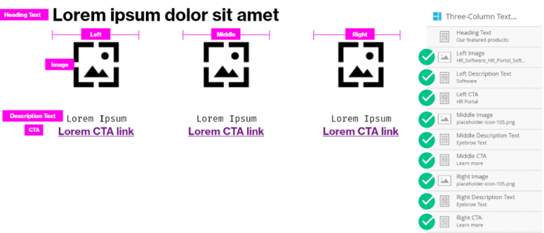
- Update the heading text by double-clicking the element, or remove it entirely by replacing with a blank snippet
- There should be no need to update any other variables unless you are stacking multiple of these modules, in which case you can remove the top spacing from the second module in order to keep proper overall spacing between elements.
- Use proper link formatting to ensure that the content renders properly if using a link
Video: Updating the Three Column Text + Image module in Marketo
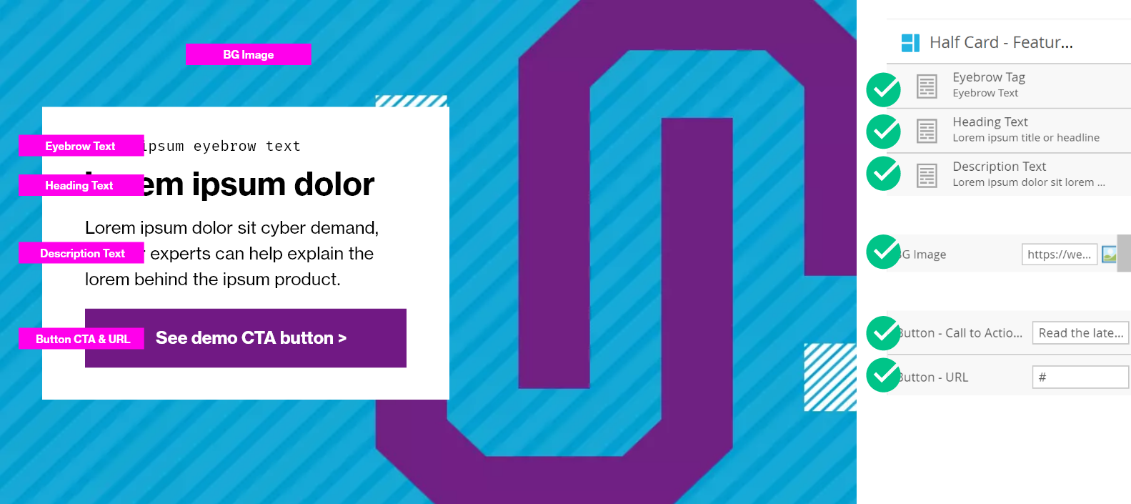
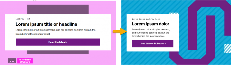
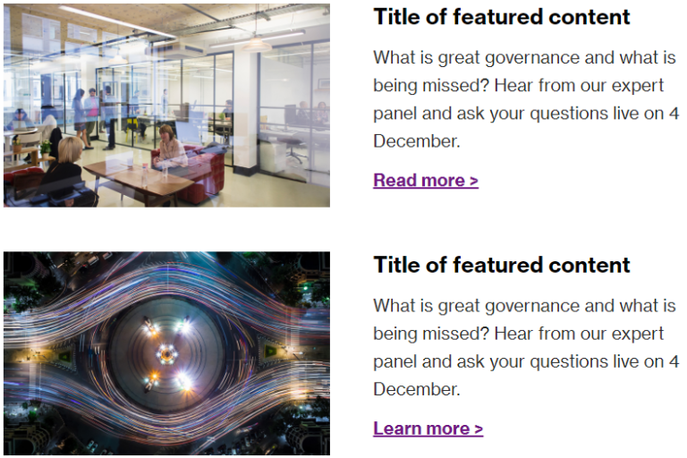
Half Card – Featured Content
Overview
Similar to the Full-Width Featured Content Module, this module boldly and prominently features content.
Visual
Specs
- BG Image – mandatory – must be 16:10 ratio. Options include:
- Brand photography: choose from the Image Library:
Images > Brand Photography - Bespoke illustration: this must be brand-approved and follow all guidelines. Examples include a featured podcast branded illustration, a COVID-19 topic featured image, or a Software Product Banner.
- Generic background color: choose from the pre-approved Marketo Image Library: Images > Backgrounds and Patterns
- Brand photography: choose from the Image Library:
- Eyebrow tag – optional – must describe the content. Examples include “Featured product” “Research” “Software” – generally it is a noun. This must not be a link. The default typography is Fira Mono for modern browsers except in cases where locations require an alternate font.
- Heading text – mandatory – display with Neue Haas Grostesk Bold or location-approved alternate font. Must not display as Fira Mono. Use reasonable character length (60 characters or less), or select a different module to accommodate your content.
- Description text – optional – paragraph text that should display as Neue Haas Grotesk Roman or location-specific equivalent.
- Button – optional –
- If using, must contain call to action text and a URL.
- If using, do not use “click here” terminology.
Usage notes
- It is not recommended not to use more than one of these per email.
- Use this variation when there is a key element (e.g. a branding element) on the right side of an image that you’d like to feature; example would be an expressive software icon
Marketo module configuration
Below are the elements (including local variables (LV) that you will need to configure if using the half-card.
Note: due to a Marketo visual editor flaw, the half-card will not look like a half-card in the modules panel of the email editor. If you toggle to preview, it will render properly, and the email will send properly as well.
Video: Updating the Half-Card module in Marketo
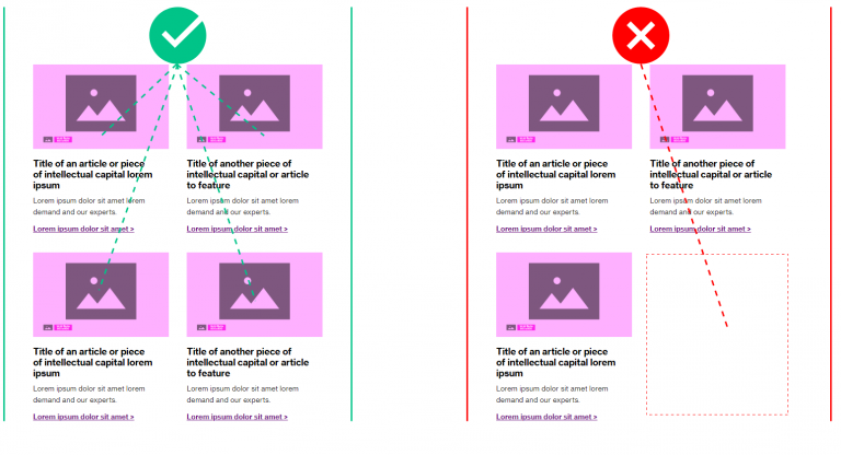
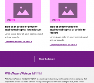
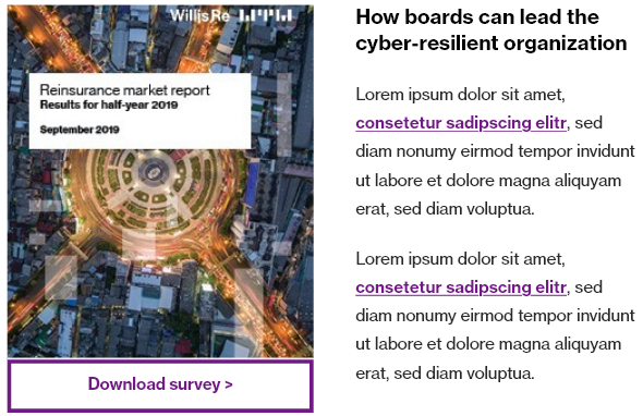
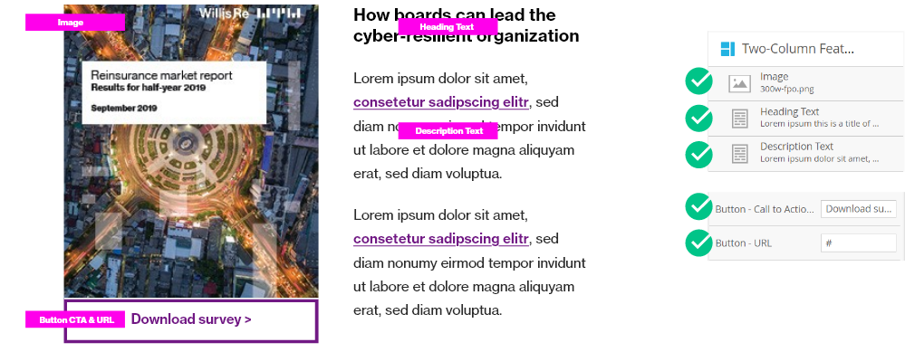
Featured Content – Two-Column Image + Text
Overview
This module offers a great way to offer secondary (but important) content to your users. Often, this module can be located underneath a Full Card – Featured Content module, representing a secondary and tertiary content suggestion. It features two side-by-side content displays with an image, title, description text, and call-to-action text.
Visual
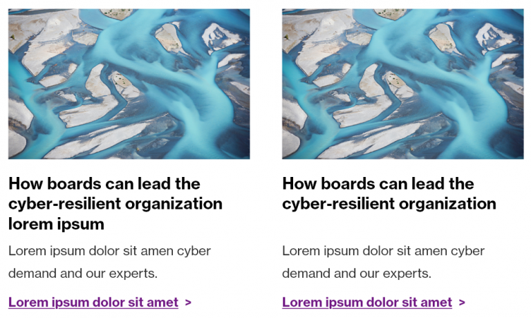
Specs
- Image – mandatory – are always 16:10 ratio (800×500 pixels); must be on-brand
- Titles – mandatory – are:
- #000000 color
- Neue Haas Grotesk Bold 75 (or location-specific equivalent)
- 25px line height
- 10px bottom spacing (between heading and either description text or link underneath it)
- Description text is:
- #2a2a2a color
- Neue Haas Grotesk Roman 55 (or location-specific equivalent)
- 26px line height
- 10px bottom spacing (between heading and either description text or link underneath it)
- Left Link / Right link – mandatory – is a hyperlink that is:
- #7f35b2 color
- Bold / Neue Haas Grotesk Bold 75
- Includes the space + chevron after the CTA text
Usage notes
It is permissible to use this module to group multiple pieces of content in a similar fashion, but they must be even (2, 4, 6…). If you have an odd number of items to be featured, take one of those articles and display it in a Full Card – Featured Content module or another similar module. Or, consider using the display of alternating articles found in the Two-Column Image Left/Text Right options.
Do not use this module alone with only one element; it will break the display in multiple views, especially mobile.
Never use the term “click here” in a call-to-action link.
Marketo module configuration
All of the information below must be completed if using the default module. Description text is optional.
Do not update the local variables of this module unless you are toggling the top or bottom spacing to adhere to spacing guidelines.
Video: Using the Two-Column Image + Text Module
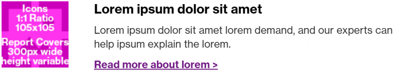
Icon/Image + Text (Small)
Overview
This is a versatile module to help feature smaller visual assets in conjunction with text or call to actions. It can include report cover thumbnails, generic icons, software product icons.
This could be used, additionally, as a module to feature descriptions without linking to content. For that reason, the link is optional.
Visual
Example using a report cover:
Example using an icon:
Specs
- Image – mandatory – 1:1 ratio, PNG (if icon/logo), JPG (if report cover), no photography
- Title – mandatory – is:
- #000000 color
- Neue Haas Grotesk Bold 75 (or location-specific font)
- Description text – optional – is:
- #2a2a2a color
- Neue Haas Grotesk Roman 55 (or location-specific font)
- Link – optional – is:
- #7f35b2 color
- Bold / Neue Haas Grotesk Bold 75 (or location-specific font)
- Always includes a space followed by the > character
Usage notes
Do not use photography; this module is for icons or report covers only
Call to action link must always end with a space followed by the > character.
Spacing:
- When placing multiple of these modules together, please ensure that the *top* module has 40px of padding.
- There should be 30px of padding in between additional elements of this module.
- There should be 40px total after the last module, in between the last module and the next module that you choose to use.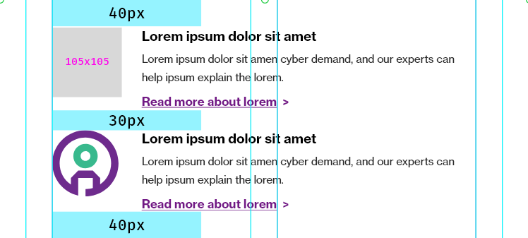
Marketo module configuration
The following variables are mandatory to update: - Image - Heading Text
The following modules are optional, but strongly recommended:
- Description Text
- Link
You should not need to update any of the local variables for this module.
Video: Using Icon + Text (Small) for Featured Reports
Video: Using Icon + Text (Small) for Software product icons
Image
Overview
Sometimes, you’ll need the ability to feature a simple image. This might be a teaser infographic, or something that does not fit into our other modules. This should be rarely used.
Visual
Specs
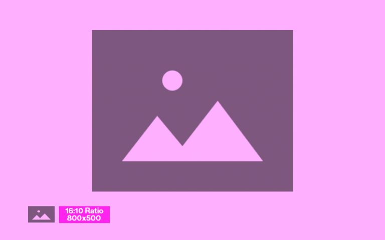
By default, a 16:10 ratio image is suggested. This is because all pre-existing brand photography is sized to 16:10 ratio at 800×500 pixels. However, in this module, you have flexibility and you can place any image, as long as the following rules are adhered to:
Branding
- Image must be on-brand and follow photography, infographic, or illustration guidelines
Sizing
- Must be sized to 800px wide
- Height is variable
File type
- Photography must be JPG
- Illustrated/infographic-type graphics must be PNGs
Usage notes
This module will not be used as often as the other modules, as the other modules offer a more modern, better use of visual space within emails. Use this module when you need all of your image to display. An example would be part of an infographic teaser, or something that must be visually communicated and cannot be achieved with other modules.
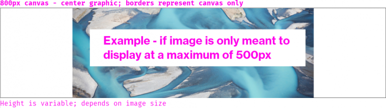
If your image is by default smaller than 800px, e.g. it is meant to render at a max of 500px, the asset uploaded must be centered on a 800px wide canvas, as seen below:
Marketo module configuration
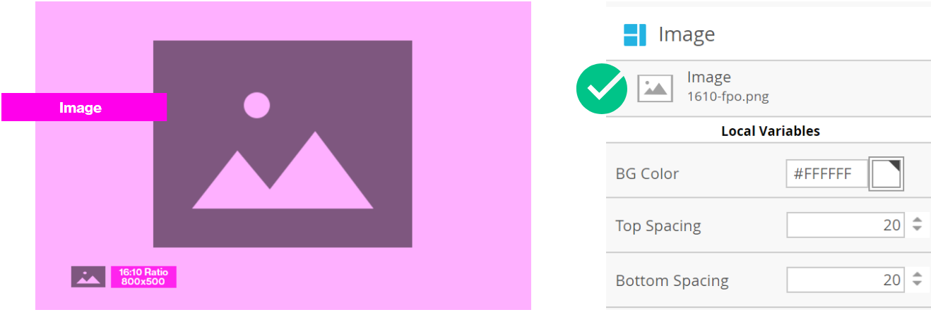
Double click the image and modify the file path. Never link to images that are not located within the Marketo image file folder system. (e.g. do not link to external files, even though that is an option in the Marketo dialogue).
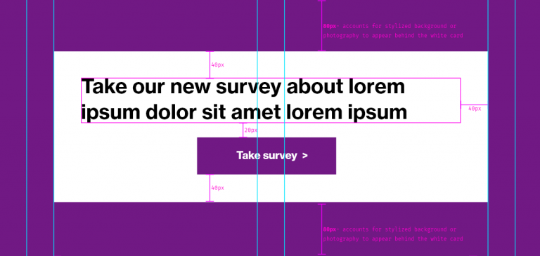
Call-to-Action Button
Overview
The call-to-action button module allows for individual call to action buttons to be added to an email. This module is useful when constructing a simple email with text module, or if you need flexibility from the existing modules in order to make a button more prominent.
An example might be a call-to-action after some text to take a survey.
Visual
There are three ways to display the Call-to-Action Buttons. They can be simple buttons (either primary or secondary are the module options in Marketo).
You can also turn the Primary Button into a full-width violet banner CTA to be similar to the Call-to-Action Module found on wtwco.com.
Specs
There are two available styles – the primary and secondary styles. No other configurations should ever be used.
- Do not add other background colors to the buttons
- Font-family is customizable for location; never use Fira Mono for the CTA buttons
Usage notes
Below is an example of using this module to break up text-heavy content, especially when an email is relatively simple in nature, and does not have additional media items to feature.
The example also demonstrates the secondary button style that is available.
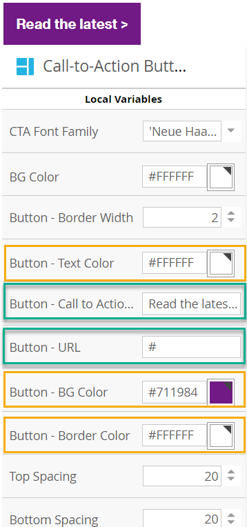
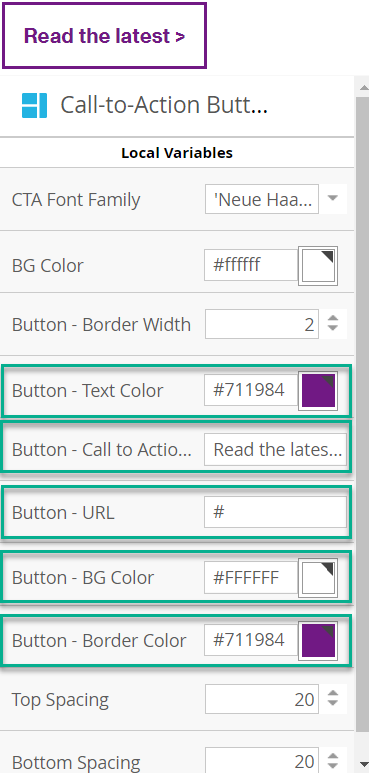
Marketo module configuration
You must always update your call to action text and add a working URL to each button.
Standard button
In order to configure the standard button, you must change the variables outlined in green below.
- Button – Call to Action
- Button – URL
Yellow simply highlights the default colors in this module.
Secondary Button
To use the secondary call-to-action style, modify the variables as noted below. Observe the following visual design changes:
- Button border changes to #7f35b2
- Button background changes to #ffffff
- Button text color changes to #7f35b2
Using a flood of violet to match our call-to-action modules
To use the flood of violet full-width call-to-action style, modify the variables as noted below. Observe the following visual design changes:
- BG Color: change to #7f35b2
- Top spacing: change to 40
- Bottom spacing: change to 40
Video: how to modify Call-to-action Button – Primary
How to modify Call-to-action Button – Secondary
Video: Applying proper spacing to buttons
Two-Column Cards w/ Icons
Overview
This module features two cards, side-by-side, and is used to feature products / services with icons in a bold manner with a splash of color in the background.
The default color for the background for featured products is the green dotted pattern as this matches the Products module on wtwco.com and keeps visual consistency.
Visual
Standard Treatment:

Standard treatment with multiple stacked modules to feature four products:

Alternate treatment using a solid WTW color background:

Specs
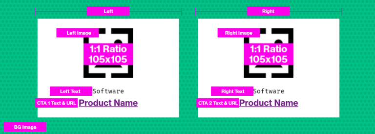
- Image – mandatory – 1:1 ratio, 105×105 pixels, PNG for icons (no photography)
- Eyebrow text – optional – displays generally in Fira Mono but can be changed if needed – should never be hyperlinked
- CTA Link Text and URL
Usage notes
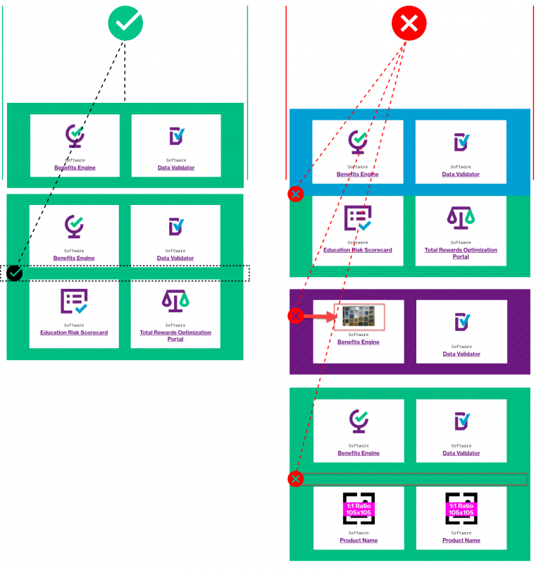
- Do not mix and match color backgrounds in an adjacent fashion:
- Do not leave extra space when stacking modules.
- Do not use photography for the image. This is a space intended for icons.
Marketo module configuration
Always update the following variables:
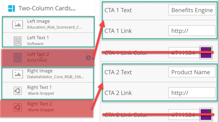
- Left Image
- Left Text
- CTA 1 Text – local variable
- CTA 1 Link – local variable
- Right Image
- Right Text
- CTA 2 Text – local variable
- CTA 2 Link – local variable
If you are stacking multiple of these modules, remember to remove the top spacing of the second module so that there is not too much additional extra space:
Video: Using Two-Column Cards with Icons module
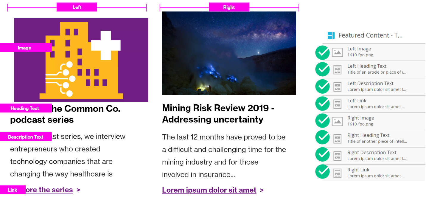
Two-Column Image + Text (Left/Right)
Overview
Instead of placing images and content side-by-side in a column format, you can opt to use a “stacking format” whereby images are placed in one column (left or right), and text is placed in the other column.
This is especially helpful if you have an odd-numbered collection of articles to feature, whereas if you have an even count of articles, it is recommended to use the Two-Column Featured Content.
There are two versions of this module:
- Two-Column Image Left + Text Right
- Two-Column Image Right + Text Left
Visual
Simple example using branded photography on the left, and detailed text on the right:

Example with three featured pieces of content, using three separate modules, alternating the images left and right to provide visual interest and intrigue. (Image Left + Text Right, Text Left + Image Right, Image Left + Text Right)
Example using two modules, with both images stacked on the left. (It is also okay to use two modules with the images stacked on the right, if needed).
Example using the Master Code in a branded email, for example, a press release or a simple announcement. Learn more about how to use the Master Code on the Marketo Email Assets page.
Specs
- Image must be 300px wide, and 16:10 ratio
- Link must be violet (#7f35b2) and bold/underlined
- Text elements are not all mandatory; at least one element must be used, but the others can be removed with Blank Snippet if needed.
Usage notes
These modules are helpful when you have three pieces of featured content. It also helps create visual intrigue by updating the location of images and text.
Marketo module configuration
Review the videos below for instructions on using this module in Marketo.
Video: Using the Text Left, Image Right Module
Video: Using multiple modules in a row and removing extra horizontal space
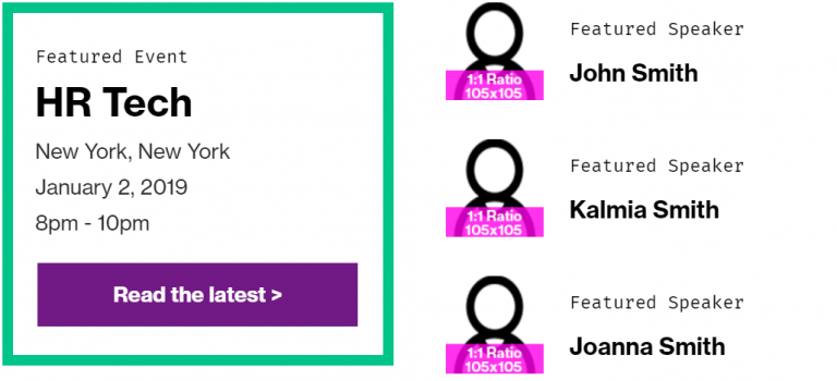
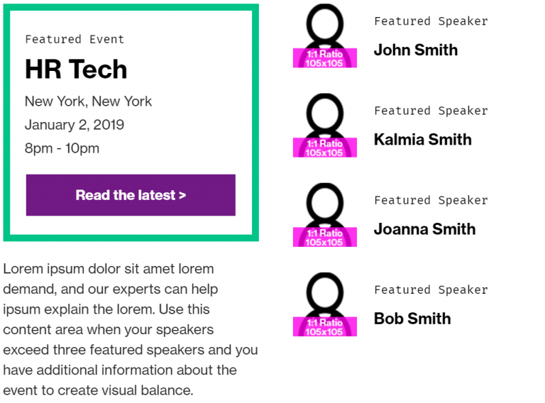
Featured Callout + Text (and alt)
Overview
The Featured Callout and text module matches a similar style for our Featured Callout in the overall digital design system.
A bold, WTW green rectangle outlines the most important content that is featured, usually related to an event or a survey.
Supporting text on the right/left (depending on the module selected) is available in the form of a rich text content editor and/or pre-defined “Speaker” sections.
Visual
Featured Callout + Text:
Featured Callout + Text Alt: (the only difference is that the green featured box is on right side instead of left side)
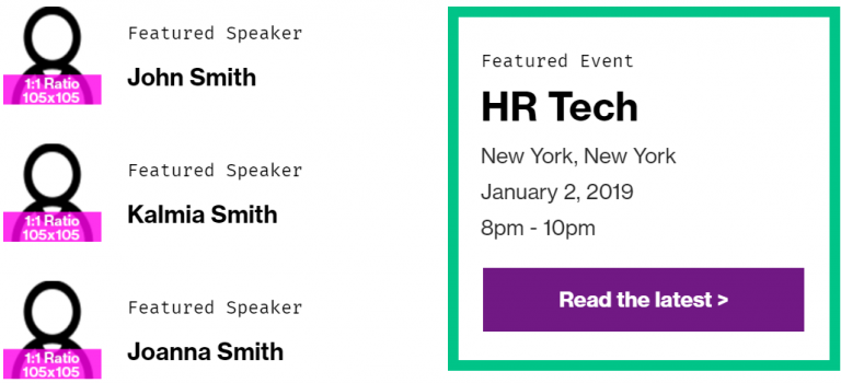
Example with minimum text used to balance the columns:

Example of using text to balance out content when you have more/less in one column:
Specs
No content for this section
Usage notes
- Call-to-action button text always requires a space followed by the > chevron
- Follow overall WTW speaker headshot guidelines (must be provided 1:1 ratio, as JPG for photography of authors/speakers)
- Never change the color of the green outline box
- In rare cases, if you need to use two of these in an email, use both modules (regular and the alt version) in order to avoid overloading one column with the green color.
- Never use the green box by itself with nothing to the left/right of it
Marketo module configuration
Below we document the standard Featured Callout + Text. The alt version simply swaps the left and right columns; all variables are the same, and “Left text” and “Right text” still describes the text placement.
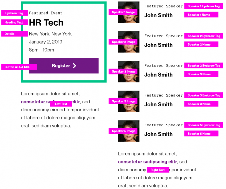
The below variables should be modified or updated each time you use this module:
- Eyebrow tag – optional; hide with blank snippet if you do not want to use it
- Heading text – mandatory
- Details – mandatory unless the heading exceeds 70 characters. Details should not exceed 100 characters, assuming the headline is < 40 characters. All text total in the module should not exceed
- Button CTA and Button URL – mandatory, ensure inclusion of > chevron in CTA
- Speaker elements – optional; hide with blank snippet if you do not want to use it.
- Recommended to use the eyebrow text to describe the “Speaker” or participants – text is flexible based on description
- Image is highly suggested – you may choose not to include one, but it will maintain the blank space and create potential for visual disunity.
- Speaker name is required if you are using the speaker element
- No space for bios in e-mail; instead, hyperlink name to Linked In bio
- Left text and Right text – always optional out of context, but should be used to provide better balance for this module, for example, if there are no speakers mentioned. This is a good place to describe an event or provide detail that cannot be fit into the green callout box.
- Video: Using the Featured Callout + Text module in Marketo
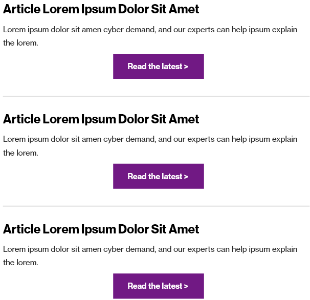
Horizontal Divider Line
Overview
A divider line is a subtle way to provide delineation to content, and helps “segment” content in a way that improves legibility.
Visual
Specs
Divider lines have the following properties:
- 2px tall
- #d8d8d8 in color (no other colors allowed)
- Generally have 40px spacing on top and 40px spacing on bottom when used (see below)
- Span the full-width of the main content column (640px) – not the full width of the entire email.
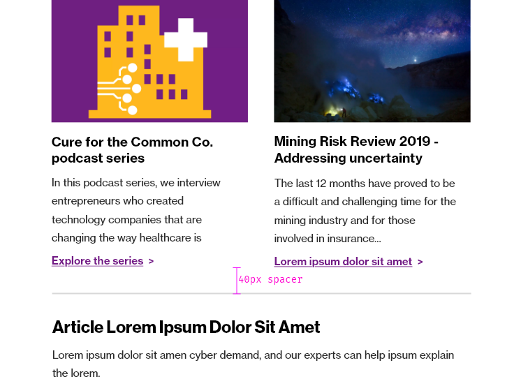
See in the below example, where a divider line is used to segment content in a neat, clean way, with adequate spacing above and below the horizontal divider line.
Usage notes
Do not use a horizontal line to divide any modules that have a solid, full-width background image. Instead, use a spacer to achieve good distance between modules with full-width background images.
Do not modify the width of divider lines so that they are inside or outside of the content blocks. Ensure that the left part of the line aligns with the left modules above and below, and ensure that the right part of the line aligns with the right modules above and below. If using Marketo, the line is pre-set at “80” and this is the correct configuration. Even if the preview mode looks different, the line is configured properly.
Marketo module configuration
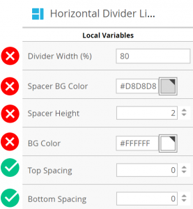
Below are the default values for the Horizontal Divider Line module.
You may modify these variables if needed, to achieve proper spacing between the divider line and other content. Remember to adhere to spacing guidelines.
- Top Spacing
- Bottom Spacing
You may not modify these variables:
- Divider Width
- Spacer BG Color
- Spacer Height
- BG Color
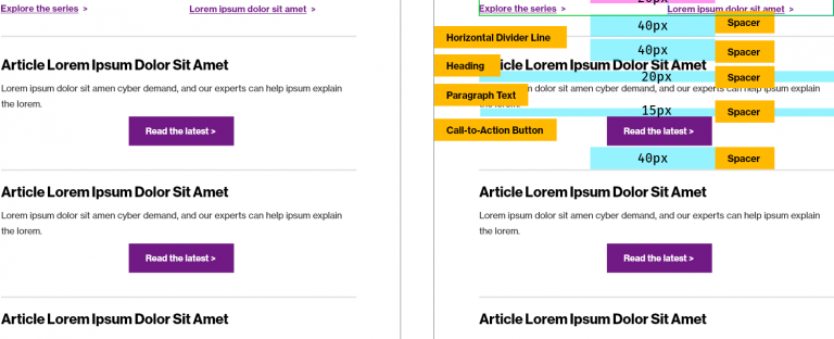
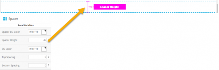
Spacer
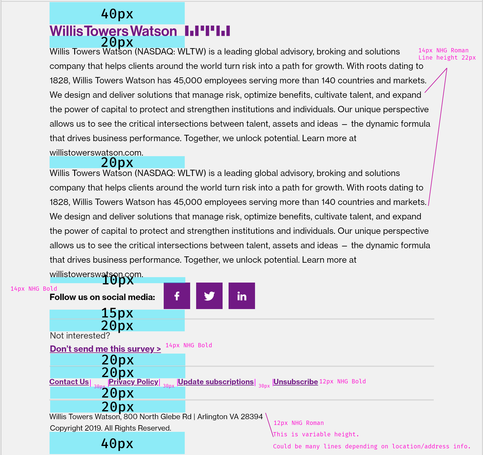
Overview
A spacer is the vertical, negative space (“white space”) between modules or elements. It is useful to provide distinction between elements and to allow breathing room. It is configurable to any space amount in pixels, but should follow specifications stated below.
Spacing vs spacer
Spacing refers to the cumulative amount of space between modules to create the proper space. A spacer is the element you can use to easily add the appropriate amount of space without diving into the variables of each element. Spacers are also helpful to use above and below horizontal divider lines to configure the appropriate amount of space.
Visual
Specs
These specifications are a cumulative amount of spacing. This does not mean that a spacer gets added between each module. This means that you must ensure that the cumulative space between elements is a certain height.
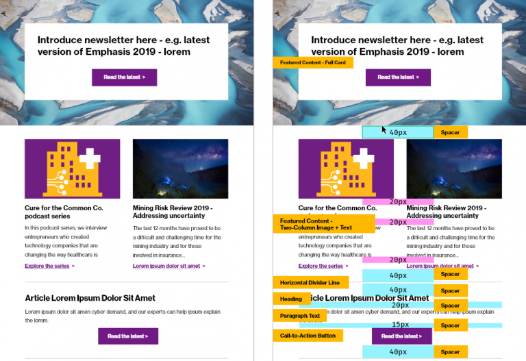
Generally, display 40px of white space total between major elements.
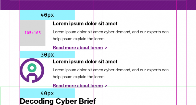
Display 20px or 30px of spacing between elements of similar categorization.
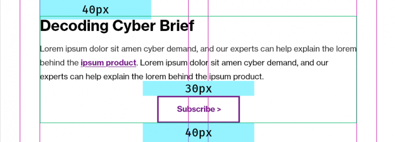
Only use spacers the following increments, assuming the top and bottom value of modules/elements it is being placed in between is zero:
- 10px
- 15px
- 20px
- 30px
- 40px
In the example below, note the build of a series of components. Yellow denotes Marketo modules, blue denotes spacer distance, and magenta denotes space incorporated within a module. On the left, the design. On the right, the design as constructed with Marketo modules and spaces.
Usage notes
Potential uses:
- Simple way to divide content, especially between two Horizontal Divider Lines
- Easy click and drag spacer without toggling variables in each Marketo module
Marketo module configuration
Add a spacer to the canvas. Update the Spacer Height variable per spacing needed.
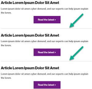
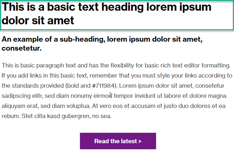
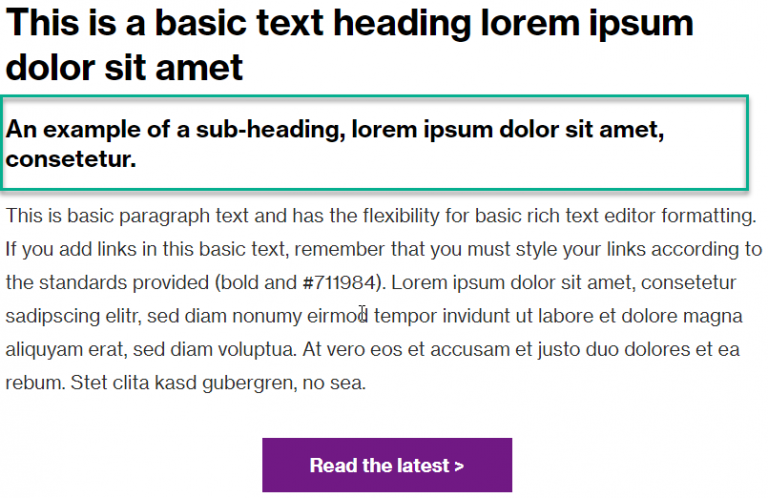
Heading
Overview
Headings are bold introductory statements inviting users into the content.
They can be versions of a headline from a piece of featured content, an announcement, etc.
Visual

Specs
Headings are:
- 30px
- Neue Haas Grotesk Bold 75 (or other bold, location-specific font)
- #000000 (pure black) – never use other colors within the WTW palette for headline colors
- Not hyperlinked. Use the call-to-action button module for navigation to content from an email.
Usage notes
- There can be multiple headlines in an email, given that headlines introduce main pieces of content. For example, a newsletter email could have multiple headlines introducing different articles:
Marketo module configuration
N/A
Text – Subheading
Overview
Subheadings can provide more context for headings. They are not required.
Visual

Specs
Subheadings are:
- 20px
- Neue Haas Grotesk Bold 75 (or bolded, location-specific font replacement)
- #000000 (pure black) – do not change the color to any other color, even if that color is found within the WTW palette
Usage notes
It’s not mandatory to have a subheading.
Marketo module configuration
N/A
Paragraph (Rich Text)
Overview
Paragraph text is body text.
Visual
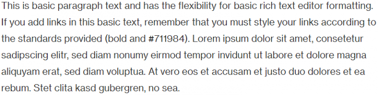
In context, it would typically be combined with a heading, possible subheading, and possible call-to-action button.
Specs
Paragraph text:
- 16px – for legibility
- Neue Haas Grotesk Roman 55 (except for locations which require alternate font display)
- #2a2a2a – for regular text. Never use other colors for paragraph text, even if they are within the WTW color scheme.
- May contain in-body links, which must be bold and #7f35b2 (WTW Violet)
Usage notes
Never change paragraph text color unless you are adding a hyperlink. Remember to update the link color and weight (to bold) if you are adding a link.
Marketo module configuration
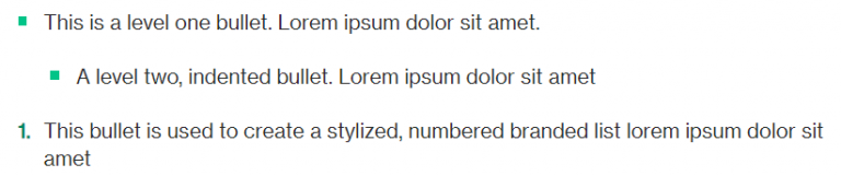
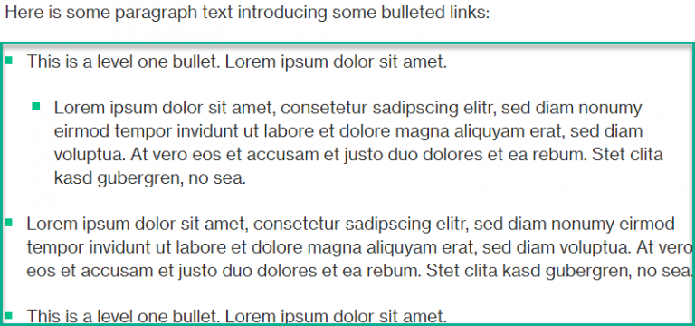
Bullets
Overview
Bullet points help improve scannability and legibility of content and provide visual focus.
There are three types of bullets available:
- Bullet – Unordered
- Bullet – Unordered – Indented
- Bullet – Ordered (Styled)
Visual
Below, an example of Bullet – Unordered followed by Bullet – Unordered – Indented followed by Bullet – Ordered (Styled):
Below, an example of Unordered bullets in context:
Specs
The unordered bullet point is a WTW green square that mirrors the style of bullet points of the overall WTW digital design system. Since bullet points are notoriously inconsistent and difficult in e-mail clients (Outlook, Gmail, etc), the bullet is actually formed by an image. This is why each bullet is an individual module and must be pulled in separately.
The ordered (styled) bullet also matches the style of the overall WTW digital design system. The WTW Dark Green is used due to its accessibility compliance. (The standard WTW green does not comply with accessibility standards, per our Color guidance).
Usage notes
- Do not change the color of bullet points in unordered lists.
- Do not change the color of the number in ordered lists.
Marketo module configuration
Video: Updating the Bullets in Marketo
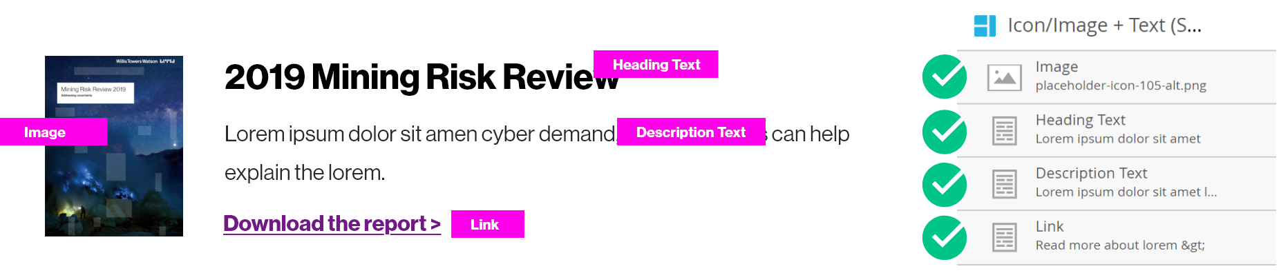
Two-Column Featured Content and CTA Button
Overview
This module is designed specifically to feature a report cover or some dominant image on the left, followed by an introduction and more text on the right.
Visual
Specs
Image – mandatory – is:
- 300px wide, height variable. PNG/JPG required
- No specific ratio: should be based on scaling a given report cover down so that its width is 300px and its height scales with it.
Button – mandatory – is:
- Depending on the color of the image above, the button can be configured. The default view is the secondary button design due to the likelihood of report color contrasts. If you’d like to update the button to be the primary style, use the instructions found within the Call-to-Action Button section.
Heading Text – optional – is:
- #000000 color
- Neue Haas Grotesk Bold 75
- Never a link; always plain text
- If you do not use Heading Text here, you should use a Heading module above this module to introduce the report/content
Description Text – mandatory – is:
- #2a2a2a color
- 16px
- Neue Haas Grotesk Roman 55
- Links can be included; remember to style links with proper color and style attributes
Usage notes
- The best use of this module is to feature a report cover.
- There are no alternate configurations of this module where the report cover is on the right.
- Always remember, if you are adding inline links, you must ensure link color/style consistency.
Marketo module configuration
The following elements must be updated to use this module:
- Image
- Heading Text
- Description Text
- Button – Call-to-Action Text
- Button – URL
Video: Using the Two-Column Featured Content and CTA Button
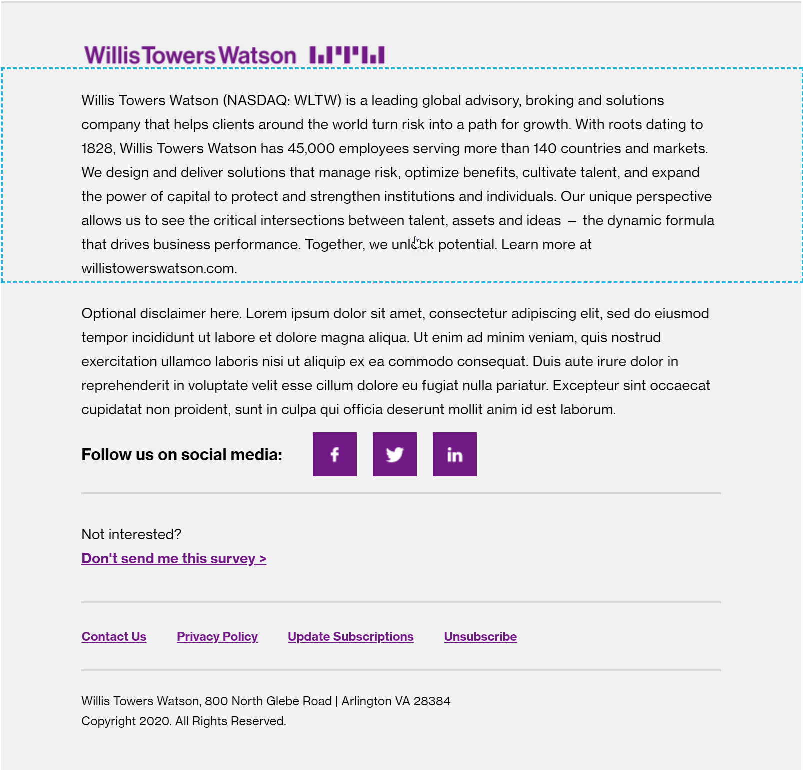
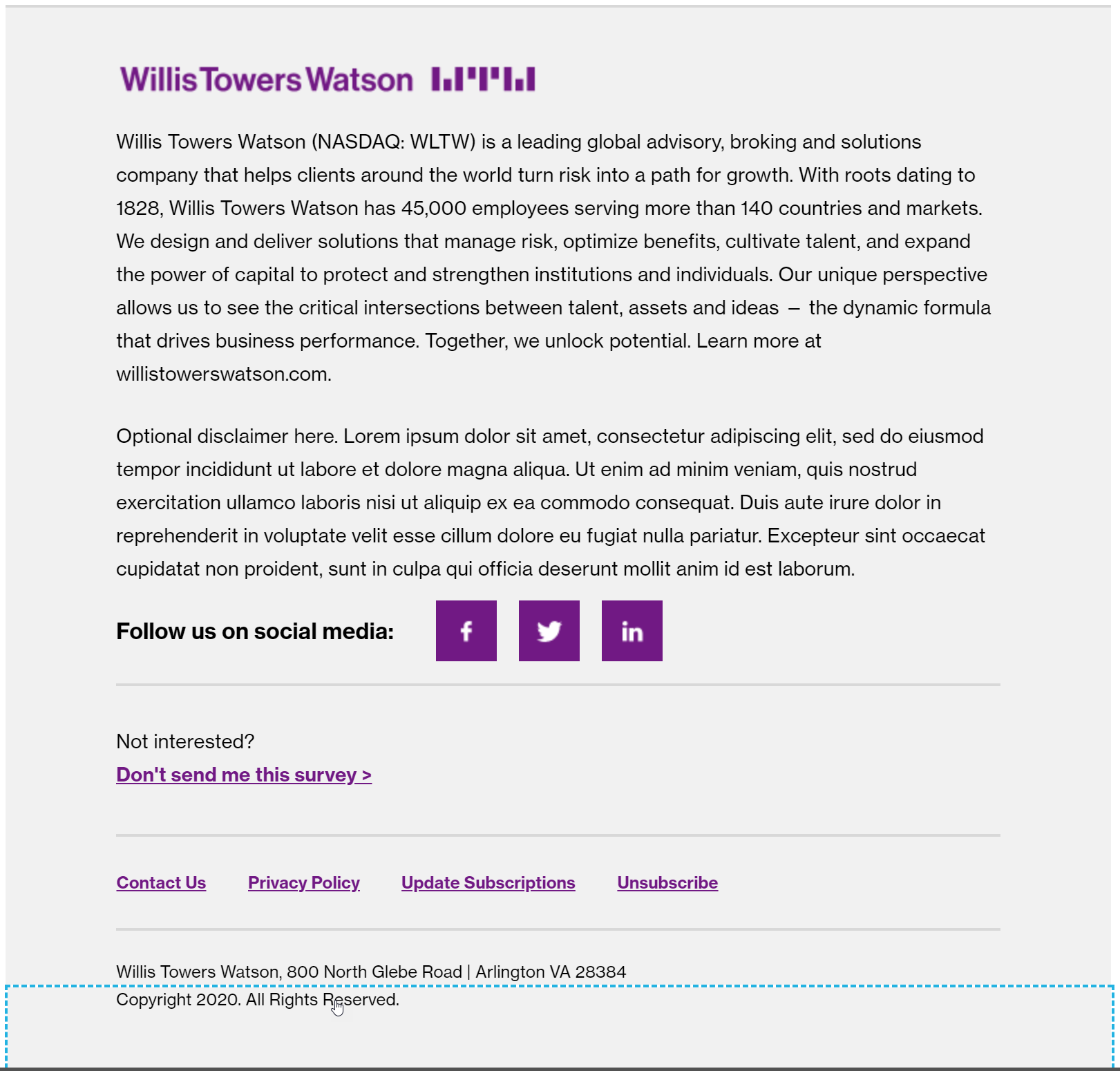
Footer
There is not one specific footer module; many modules comprise a proper email footer.
The footer modules are pre-configured and will need very little (if any) customization. Mostly, a person sending an email needs to ensure that they are using the correct snippets, have ordered items correctly, and are following each footer module’s specifications.
Maximum footer modules, in order (Marketo modules):

General footer spacing and specifications:
Footer Logo
Mandatory Component
Overview
This is always included in the footer.
Visual
Below, in order:
Specs
This component is managed by the corporate digital marketing team.
- Must always have a 2px solid #d8d8d8 border. Do not change the color or thickness of the border.
- Must always be a #f1f1f1 background. Do not change the background color.
- Must always include the WTW logo.
Usage notes
- Managed by the corporate digital marketing team via a Marketo Snippet
Marketo module configuration
- Managed by the corporate digital marketing team via a Marketo Snippet
Footer – Boilerplate
Possibly mandatory in your location – check with your country or regional Legal team for specific requirements
Overview
This is usually included, and always appears right after the logo, before the optional disclaimer/other footer modules.
Visual
Below, in order:
Specs
- #2a2a2a color
- Neue Haas Grotesk Roman 55
Usage notes
- Managed by the corporate digital marketing team via a Marketo Snippet
Marketo module configuration
- Managed by the corporate digital marketing team via a Marketo Snippet
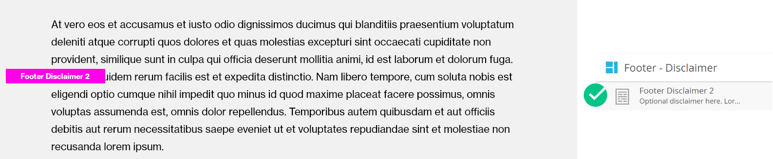
Footer – Disclaimer
Possibly mandatory in your location – check with your country or regional Legal team for specific requirements
Overview
This is not always included, but if it is included, it must be located below the boilerplate and above the social icons.
Visual
Below, in order:
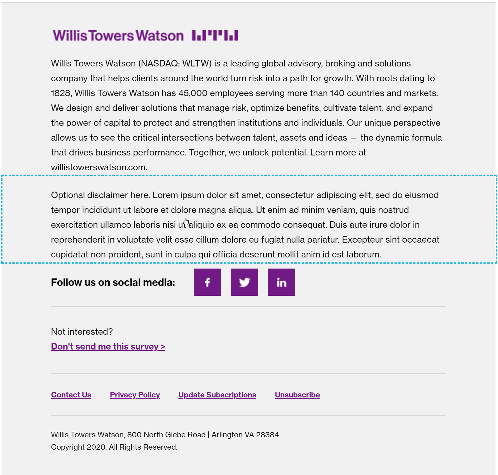
Specs
- If used, this must always go below the boilerplate and above the social media icons
- #2a2a2a color
- 14px Neue Haas Grotesk Roman 55
Usage notes
- This is rich text, so it’s fairly flexible.
- Do not use this module for content; this is for footer-related information only.
Marketo module configuration
Campaign Opt-Out
Overview
This module is totally-optional and is the only module located in the footer section that can actually be moved to the main body of content.
This module is used in instances where you are running a campaign and need to provide the option for a user to easily opt-out of a campaign (instead of opting out of all emails).
Visual

Below, in order:
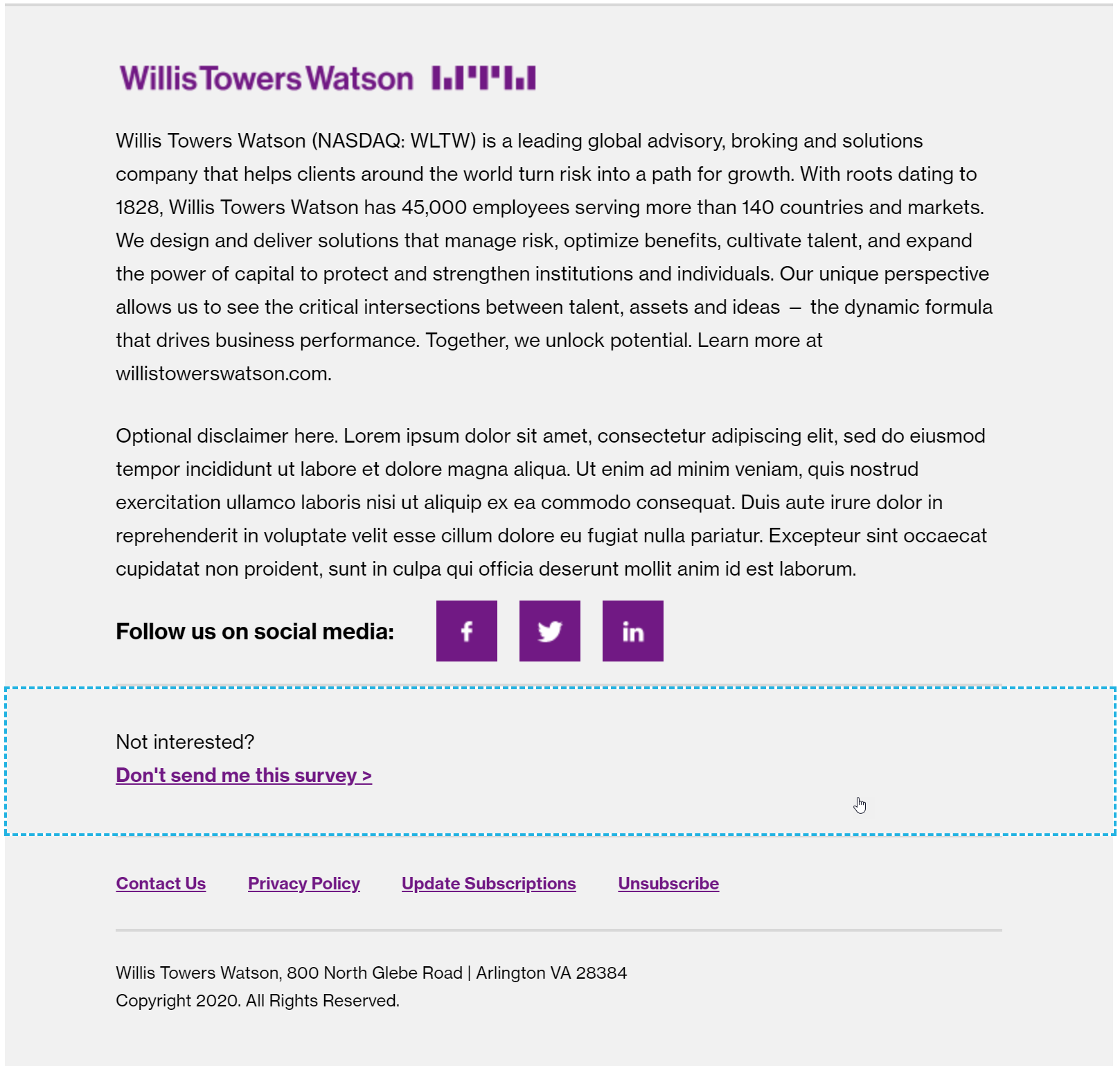
Example, when used in the body of a footer:
Example, when used in the footer of an e-mail:
Specs
- This module may be placed outside of the footer
- Background color must be white if using within the body of the email
- Background color must be the default #f1f1f1 if using in the footer of the email
- Maintain proper spacing above and below the content at all times (independent of its location in the email)
Usage notes
- This is a rich text module
- Change the variables as needed but remember the proper styling
- Link – must be Neue Haas Grotesk Bold 75 and #7f35b2, underlined, with a space + > chevron treatment
- Text – must be Neue Haas Grotesk Roman 55 and #2a2a2a
Marketo module configuration

Update the text as needed for your campaign.
Important, if using the module in the middle of your e-mail body (instead of in the footer):
Update the background color so that it matches the #FFFFFF white of the rest of the email body:
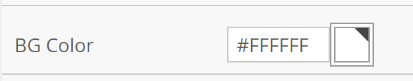
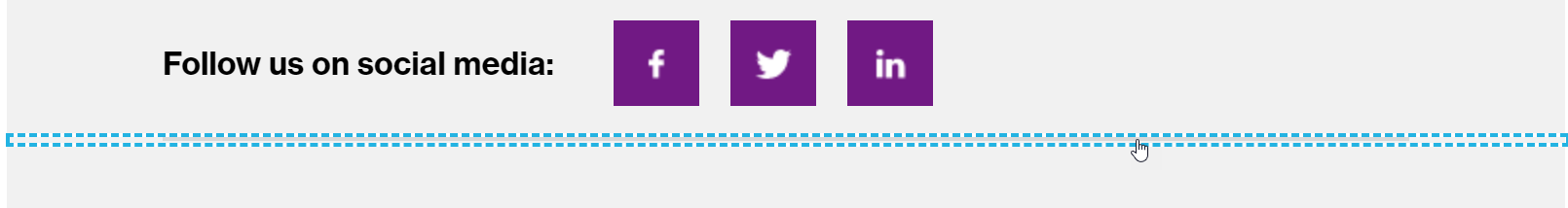
Footer – Social Icons
Recommended Component
Overview
The social icons were designed to be optimized for touch devices (tablet and mobile) and encourage users to interact with us on social media.
Visual

Below, in order:
Alternate version using Xing (another social network):
Specs
Icons must be created by the corporate digital marketing team and always use #7f35b2 as a background with a white social logo.
Usage notes
Managed by the corporate digital marketing team via a Marketo Snippet.
Marketo module configuration
Managed by the corporate digital marketing team via a Marketo Snippet
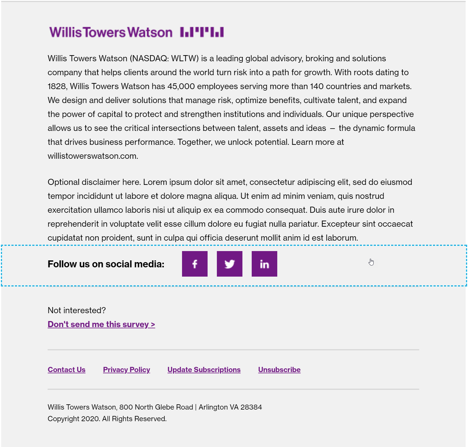
Footer – Company Address
Mandatory Component
Overview
This module provides the company address, which varies by location.
Visual

Below, in order:
Specs
- 12px Neue Haas Grotesk Roman 55
Usage notes
Managed by the corporate digital marketing team via a Marketo Snippet.
Marketo module configuration
Managed by the corporate digital marketing team via a Marketo Snippet.
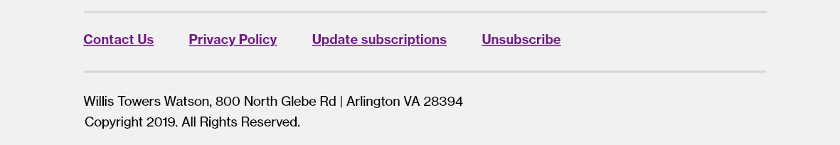
Footer – Copyright
Mandatory Component
Overview
This module provides copyright information.
Visual

Below, in order:
Specs
- 12px Neue Haas Grotesk Roman 55
- 40px bottom spacing (padding)
Usage notes
Managed by the corporate digital marketing team via a Marketo Snippet.
Marketo module configuration
Managed by the corporate digital marketing team via a Marketo Snippet.
Footer Divider Line
Overview
A simple divider line to break up content within the footer.
Visual
Below, in order:
Specs
- 2px solid #d8d8d8
- #f1f1f1 background for full-width coverage
- Used in the following places, always:
- Below Footer – Social Links
- Below campaign opt-out (if used)
- Below Footer Links
Usage notes
- Use where directed in the specifications above.
- Do not add additional divider lines.
- Do not change the color of divider lines.
- Do not increase the height of divider lines.
Marketo module configuration
No configuration needed; just ensure it is placed in its proper locations.
CTA Chevron and Link Modifications in the Marketo Email Editor
All links must be styled as bold, underlined, and violet (#7f35b2). Always update your links in the rich text editor with proper styling.
Links in the body
If you have a paragraph with a link in the body of the paragraph, you must simply highlight your hyperlink, ensure that the link is bold, update the color to violet (#7f35b2). It should underline automatically.
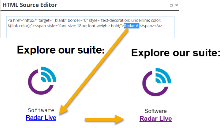
Links in existing modules
It is best to modify the link by opening the editor and updating only the text value inside the tag. Otherwise, the proper link styling will be skewed. In the Marketo email editor, it will look blue, but the emails sent will have the correct styling and specific style variables below:
Call to action links
If you are placing a standalone link in HTML, and it is a call-to-action (vs an in-body link, which is part of a paragraph), or a list of links, you will need to ensure proper styling of the CTA links for consistency.
Add the chevron – The easiest way to ensure consistency is to open the HTML view of the rich text editor and right after your link, inside the (
) tag, type in (>) which is the HTML code for >. Placing the > within the tag means it will properly style the link violet. If you are not working within a rich text editor, and you are modifying a variable, simply type > and this will render properly.Bold the link – all links should be bolded. Because this is being added in a rich text editor with the non-bold text, you will need to specifically bold this text within the editor.
Update the color – the link should display as WTW Violet (#7f35b2). Links should never display as blue.
Table Styling in Marketo Email Editor
Tables are rarely used in e-mails but may, in some cases, be used.
Given the complexity of tables in e-mail, we discourage use of your typical data-intensive table. Instead, send your users to a web page with the table.
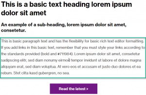
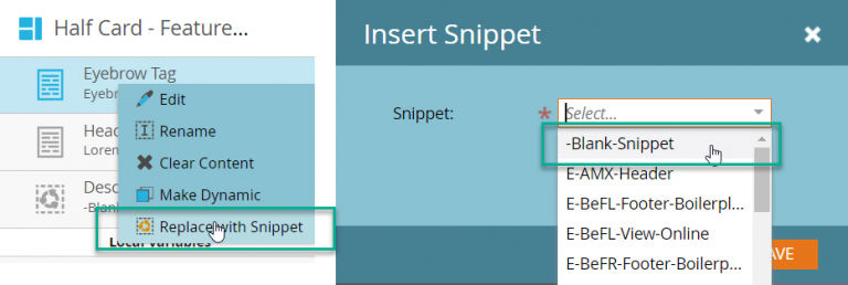
Blank Snippet
Occasionally, you will need to remove an optional element from a module. For example, you might not want to include description text in a module.
In order to do this, you need to replace the element with a Blank Snippet.
If, for example, you do not want to use an element of the half-card, such as the Eyebrow Tag, you would Replace with Snippet and select “-Blank-Snippet”.
In the below example, the Eyebrow Tag and the Description Text have been replaced with a blank snippet. On the left, what you will see in the Marketo editor. On the right, what you will see rendering in an actual email.
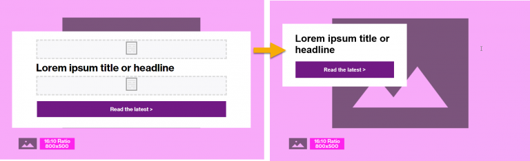
This is helpful when headlines are longer or optional elements need to be removed.
Updating the Font Family
There are a few reasons that you may need to update the font variables in Marketo:
Changing the font variables for location-specific fonts
Changing the font variables from Fira Mono to Neue Haas Grotesk Roman or Bold
Changing the font variables for location-specific fonts
When working with a local language, you may need to replace the Neue Haas Grotesk font with an appropriate, e-mail client-friendly font family.
All fonts are managed by the corporate digital marketing team in Marketo; reach out to Steve Bottjer and Katie Cisto if you have a request for a font for your locality.
| Location | Font Family Name |
|---|---|
| China | Microsoft YaHei |
| Taiwan | Microsoft JhenHei |
| Korea | Malgun Gothic |
| Japan | Meiryo UI |
| Default, non-branded | Arial |
For example, when creating an email for Korea, the variables need to be configured in each module to ensure proper rendering.
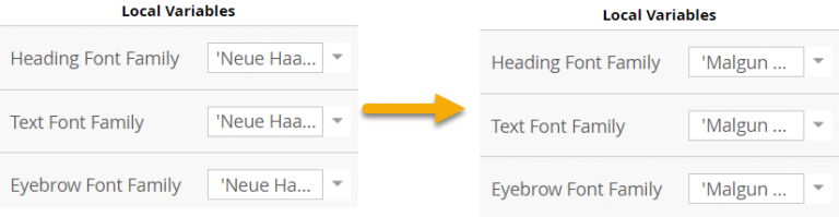
Changing the font variables from Fira Mono to Neue Haas Grotesk
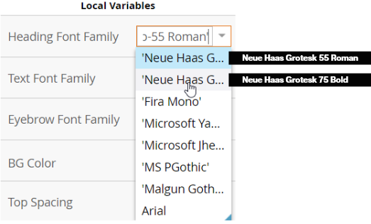
You may also find the need to replace Fira Mono with Neue Haas Grotesk (this depends on the content you are using). This can be configured in the local variables section.
You will need to select whether you need Neue Haas Grotesk Roman or Bold. This depends on the content: if you are swapping out Fira Mono because you want that area to format like a title, you must use Neue Haas Grotesk Bold. If you are swapping out Fira Mono because you are replacing it with descriptor text, you should use Neue Haas Grotesk Roman.
It can be slightly difficult to see the full name of the variables in the dropdown. Below, note that the first ‘Neue Haas G… is always Neue Haas Grotesk Roman 55, and the second is always Neue Haas Grotesk 75 Bold
Video: Updating the local variable to replace Fira Mono
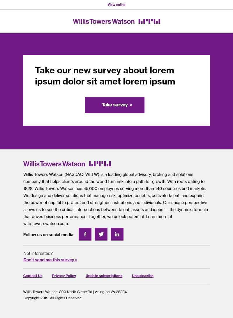
Global Variables
You will note that each Marketo e-mail template has “Global Variables.” There are two values under these Global Variables. Do not modify them.
Link color – must always be #7f35b2
Background color – must always be #fff (white). Do not change to gray or another color.
“Removing” an image from a module
Sometimes, you may not have or want an image to show in a module.
For example, you might want to place text in “two columns” side-by-side, using the Two-Column Image + Text module. (In that section of the documentation, there is a video showing how to replace the image.)
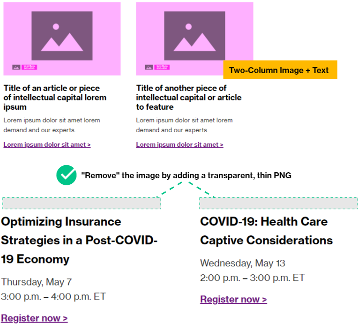
In some modules, you can replace the image variable with a placeholder PNG. Simply replace the default module image path with the path below:
https://web.willistowerswatson.com/rs/742-LZY-231/images/placeholder-transparent-image.png
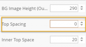
Adding background images in modules
Background images in emails are a more “sophisticated” approach in the email world. You’ll find that many of the modern email clients (Apple, Gmail, etc) support background images flawlessly. However, Microsoft Outlook is notoriously unfriendly with background images.
In order to achieve the sophistication we are looking for with background images in Outlook, we needed to use a Microsoft-proprietary language called VML (Vector Markup Language). The details below pertain only to Microsoft Outlook, as every other client is “smart” and knows how to handle background images.
For the most part, you can/should continue to use background images as usual. The amount of text displayed on top of the image dictates the needed height for an image. Generally speaking, you should never exceed 500px height in your background cards (whether using half- or full- cards).
When your text amount is smaller, and the image needs to display at less than 500px high, the following visual helps explain what happens. The image displays at the correct proportions, and the “extra” part of the image is “hidden” by the smart email clients. You can (optionally) configure the Outlook height to ensure a successful user experience without too much “extra image”. There are videos below explaining how to go about this process.
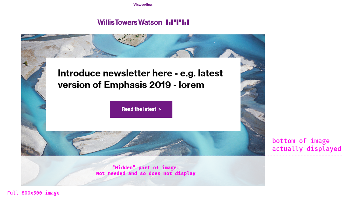
visual of background image display with VML tile
The modules are set up for VML “tile” which means that if the content height exceeds 500px, the image will repeat itself. This is not a “bug” – this is a good indicator that you need to have a designer create a custom image size, decrease the amount of text you’re using, or use a different module entirely.
Email Background Images – How to modify Outlook Height
Email Background Images – Modifying Half Card Height with Smaller Images
This may be used when using the full or half card modules to simulate a banner (e.g. for a newsletter) which needs to be shorter than 500px.
Email Background Images – How to modify the Outlook height for images taller than 500px
This will rarely be used, and in fact will require a properly-sized image from a designer.
Pro tip: Use Chrome Inspector to easily determine Outlook background image height
If you’re wondering how to figure out exactly how tall your Outlook image height should be (especially if it needs to be shorter than the default 500px), you’ll find the next video helpful!