An “enlarge” indicator icon lives on the top right-hand corner and allows users to make the content for better readability. This is best used for graphs, charts, detailed infographics, or items that use data as the primary purpose.

The enlarge icon itself is deliberately round, with a mostly white background and violet strokes to create visual distinction from other square elements on the page or in the image. The icon within the indicator represents the action of enlarging something to the full screen, as commonly seen within media (including our own video player).

When a user clicks on an “enlarge” indicator, the image opens within a modal and expands to fit the width of the grid based on the user’s viewport. The image is centered and include the modal title and a caption. The background of the page is covered with a 90% black opaque overlay to keep the focus on the image and not the content behind it.

lightbox design detail

<p><a href="#" data-toggle="modal" data-target="#exampleModalTable" aria-label="Modal, Table, click to open 2018 Benefits values"><i class="material-symbols-outlined" aria-label="hidden">fullscreen</i>Enlarge this table</a></p>
<!-- Modal -->
<div class="modal fade" id="exampleModalTable" tabindex="-1" role="dialog" aria-labelledby="exampleModalLabelTable" style="display: none;" aria-hidden="true">
    <div class="modal-dialog modal-xl" role="document">
        <div class="modal-content">
            <div class="modal-header">
                <h5 class="modal-title" id="exampleModalLabelTable">Table - Large and in Modal</h5>
                <button type="button" class="close" data-dismiss="modal" aria-label="Close this modal">
                    <span aria-hidden="true"><i class="material-symbols-outlined">close</i></span>
                </button>
            </div>
            <div class="modal-body">
                <table class="bg-white table table-hover p-3 d-block">
                    <caption class="bg-white">List of users</caption>
                    <thead>
                        <tr>
                            <th scope="col">#</th>
                            <th scope="col">Second</th>
                            <th scope="col">Third</th>
                            <th scope="col">Fourth</th>
                            <th scope="col">Fifth Longer</th>
                            <th scope="col">Sixth Even longer</th>
                            <th scope="col">Seventh</th>
                            <th scope="col">Eight Lorem Ipsum dolor sit amet lorem sfjk afdlk adfjlk asdfjlk asdfjldjkl </th>
                        </tr>
                    </thead>
                    <tbody>
                        <tr>
                            <th scope="row">1</th>
                            <td>Mark</td>
                            <td>Otto</td>
                            <td>@mdo</td>
                            <td>@mdo</td>
                            <td>@mdo</td>
                            <td>@mdo</td>
                            <td>@mdo</td>
                        </tr>
                        <tr>
                            <th scope="row">2</th>
                            <td>Jacob</td>
                            <td>Thornton</td>
                            <td>@fat</td>
                            <td>@mdo</td>
                            <td>Thornton</td>
                            <td>@fat</td>
                            <td>@mdo</td>
                        </tr>
                        <tr>
                            <th scope="row">3</th>
                            <td>Larry</td>
                            <td>the Bird</td>
                            <td>@twitter</td>
                            <td>@mdo</td>
                            <td>the Bird</td>
                            <td>@twitter</td>
                            <td>@mdo</td>
                        </tr>
                    </tbody>
                </table>
            </div>
            <div class="modal-footer">
                <button type="button" class="btn btn-lg btn-outline-primary" data-dismiss="modal">Close</button>
            </div>
        </div>
    </div>
</div>
<!-- End Modal -->

<p>Use this option for text-only (when space is an issue and you're not displaying the image on the page)</p>
<p><a href="#" data-toggle="modal" data-target="#exampleModal" aria-label="Modal, Click to enlarge Managing Performance in the New World of Work"><i class="material-symbols-outlined" aria-label="hidden">fullscreen</i>Enlarge this infographic</a></p>
<br>
<p>Use this option when you're already featuring the image, but need to provide a larger size.</p>
<!-- Infographic Bootstrap Modal -->
<div class="featured-infographic">
    <div class="card inline-media sr-reveal" data-sr-id="0" style="visibility: visible; transform: matrix3d(1, 0, 0, 0, 0, 1, 0, 0, 0, 0, 1, 0, 0, 0, 0, 1); transition: transform 0.5s ease 0s;">
        <div class="infographic-image">
            <img class="card-img-top" src="/images/chart-silent-cyber-risk-factor-by-line-of-business.svg" alt="Infographic about managing performance in the new world...">
            <!-- Button trigger modal -->
            <div class="button-container">
                <button type="button" class="p-2 btn btn-lg btn-primary btn-outline-primary btn-modal-enlarge" data-toggle="modal" data-target="#exampleModal">
                    <span class="sr-only">Open this Infographic in a larger lightbox modal</span>
                    <i class="material-symbols-outlined" aria-label="hidden">fullscreen</i>
                </button>
            </div>
        </div>
        <!-- end infographic image-->
        <div class="card-body">
            <div class="card-title mb-0 font-weight-semibold font-mono">Caption headline. Lorem ipsum dolor sit amet.</div>
            <p class="card-text font-p-small">Caption body. Lorem ipsum dolor sit amet, consectetur adipiscing elit, sed do eiusmod tempor incididunt ut labore et dolore magna aliqua.</p>
        </div>
    </div>
    <!-- Modal -->
    <div class="modal fade" id="exampleModal" tabindex="-1" role="dialog" aria-labelledby="exampleModalLabel" style="display: none;" aria-hidden="true">
        <div class="modal-dialog modal-lg" role="document">
            <div class="modal-content">
                <div class="modal-header">
                    <h5 class="modal-title" id="exampleModalLabel">Infographic: Managing Performance in the New World of Work</h5>
                    <button type="button" class="close" data-dismiss="modal" aria-label="Close this modal">
                        <span aria-hidden="true"><i class="material-symbols-outlined">close</i></span>
                    </button>
                </div>
                <div class="modal-body">
                    <div class="infographic-container">
                        <img src="/images/chart-silent-cyber-risk-factor-by-line-of-business.svg" alt="Infographic about managing performance in the new world...">
                        <div class="card-body">
                            <div class="card-title mb-0 font-weight-semibold font-mono">Caption headline. Lorem ipsum dolor sit amet.</div>
                            <p class="card-text font-p-small">Caption body. Lorem ipsum dolor sit amet, consectetur adipiscing elit, sed do eiusmod tempor incididunt ut labore et dolore magna aliqua.</p>
                        </div>
                    </div>
                </div>
                <div class="modal-footer">
                    <button type="button" class="btn btn-lg btn-outline-primary" data-dismiss="modal">Close</button>
                </div>
            </div>
        </div>
    </div>
    <!-- End Modal -->
</div>

A lightbox (or modal) is a component that allows for content to be opened in an overlay which features a larger display of that content. This is most useful with infographics.

When do you need a lightbox/modal? When your content is too small to be read at normal desktop size within an image (infographic) or a chart/graph. Lightbox functionality should be used tastefully to improve user experience.

Do not overuse lightboxes; only use them when the content within your image (infographic, chart, graph) or table is too much for the container on the page.

You must follow all WCAG 2.1 AA guidelines and you must adhere to all accessibility requirements within the HTMl code.

Because of the interactive features of modals, you must ensure that you are completing all required elements appropriately. For this reason, we recommend not overusing modals, as it is better for the content to live directly on the page unless an enlarged version is specifically needed.

HTML warning – remember to change IDs of the target infographics. You cannot have multiple identical IDs on one page.

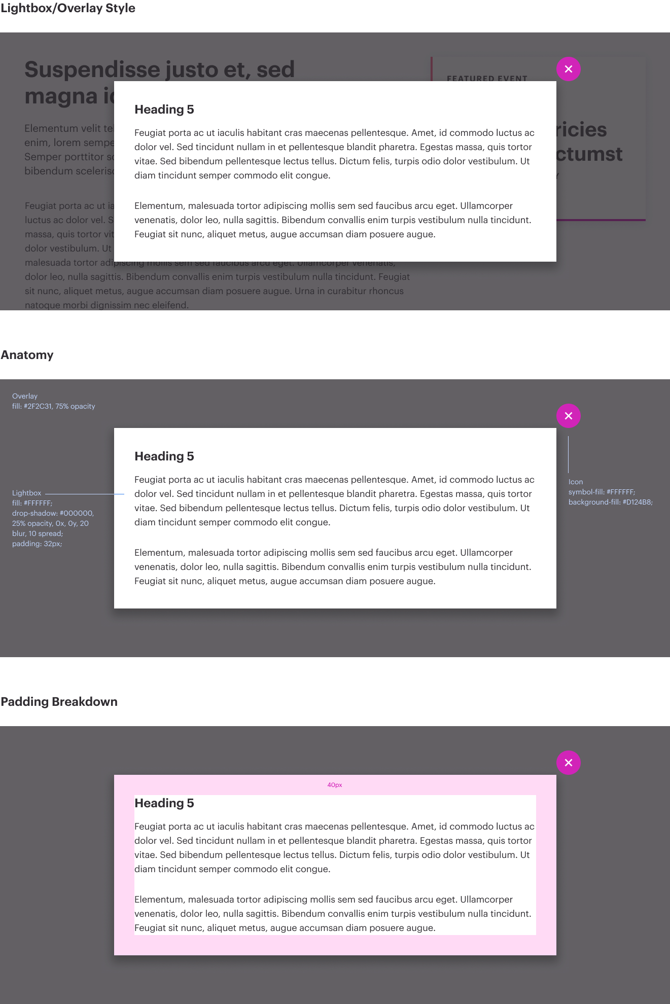
Lightbox/Modal with Infographic

Use this version in its entirety when placing an infographic or large featured image within a modal. Notice that there are variations – modal-lg and modal-xl. Choose the option that best fits your content. The modal-lg class displays at a max-width of 800px, and the modal-xl class displays at a max-width of 1000px.

Two elements are needed to make a modal functional:

  1. An initiating button/link,
  2. Modal content

Option A – Button

alt text

A modal always has an indicator to enlarge the infographic, but it’s also possible to initiate a modal via a link. Below, you’ll see the code that is mandatory for the fullscreen button.

The fullscreen button is lightly transparent and lives on the upper right side of the infographic container. The aria-label attribute is important here as this button has no apparent functional text to support it otherwise.

Always make sure you:

  • update the ID in the data-target value to match the ID of the modal. If you have multiple modals on a page, their IDs must be unique.
  • update the <span class="sr-only">...</span> text if the functionality of the button is anything besides opening the infographic in a larger container

Option B – Linked Text

alt text

Always make sure to:

  • update the ID in the data-target value to match the ID of the modal. If you have multiple modals on a page, their IDs must be unique
  • update the aria-label of the link if the text is not descriptive enough to satisfy accessibility requirements
  • Optional – you can remove the “enlarge” indicator item by deleting the <i></i> tag if you’d like to use this as a simple link.

Step 2: Create the modal container and supporting content:

Adding the modal container for the complete infographic organism

A modal must have content, and when you’re using infographics, it’s a simple process. Replace the following values below:

  • <img> src values (they must match) for the on-page and in-modal versions <span class="sr-only">...</span> if the functionality of the open button needs to be described differently
  • Update the caption and caption body for both the on-page and in-modal versions
  • Make sure the data-target attribute of your <a> link or <button> matches the ID of the modal container. In the example below, data-attribute="#exampleModal" matches the <div class="modal fade" id="exampleModal"> element

Lightbox/Modal with Table

For WTW, we use the lightbox/modal for infographics and tables. Below you will find the proper structure for a table within a modal. Note that there are specific classes that have been added that must remain in order for the proper styles to render.

The first element is a link – this can be called from anywhere (as a standalone link, as an in-body link, etc). Simply update the “data-target” value with the ID of the modal. Remember, if you are using multiple modals on the page, each ID must be unique, otherwise the modals will break. To trigger the modal, use simple text with the appropriate aria-label, if required. Ensure that the data-target has the same value as the ID of the modal it will open.

Step 2: Add the modal and content

Next, add the modal. This is set to be hidden on the page until clicking on the modal reveals the popup. It is recommended to modify the modal code outside of Sitecore or any CMS, and simply copy and paste your HTML into the editor. Note that some of the classes are different here on the table in order to achieve the proper styling within the modal. Those classes – on the <table> element, p-3, d-block and bg-white – are mandatory within a table in a modal. Additionally, there is a bg-white class on the <caption> tag. If you ensure that you’ve added those classes to your table, you’re ready to go.


Optional Configurations

Large modal vs. Extra large modal

If you need your modal to display wider than 800px, use the modal-xl class on the modal-dialog container, which will increase the width of the modal to 1000px.


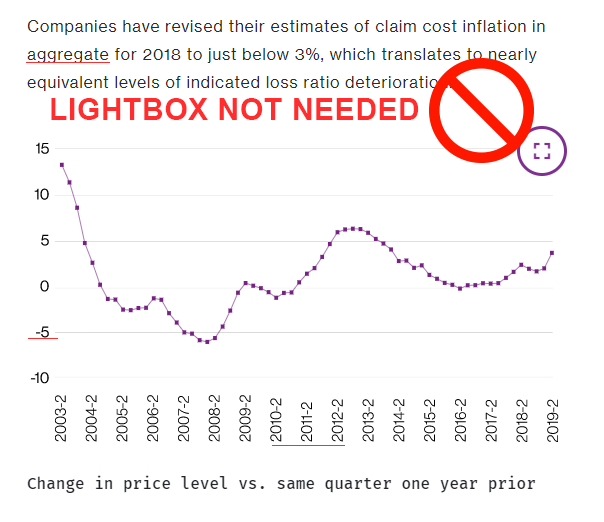
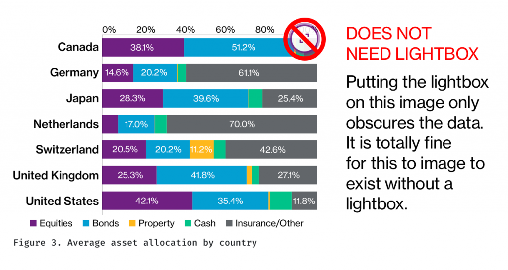
Do not use a lightbox when it isn’t needed to display the content.

In the example below, the image was created to the proper specifications and the text is large enough to match the body text. In this case, a lightbox is unnecessary, clutters the image, and complicates the production of the page.

alt text

alt text

Do not place the caption text above the lightbox. Similar to Inline Images with Captions, the caption must always be placed underneath the image.