Form elements should be labeled with a clear message that is easy to understand for the user. Limit the number of form elements to just the required elements so as to not overwhelm the user.
Elements need to be operable by a keyboard, not just a mouse. For mobile, the touch target size needs to be greater than 44px (element + padding).
Focus styles help with accessibility and should be usable with keyboards, voice control, and screen readers. Make sure that the focus state doesn’t initiate a change of content, that should only be initiated by the users request and they need to have the ability to turn off such changes.
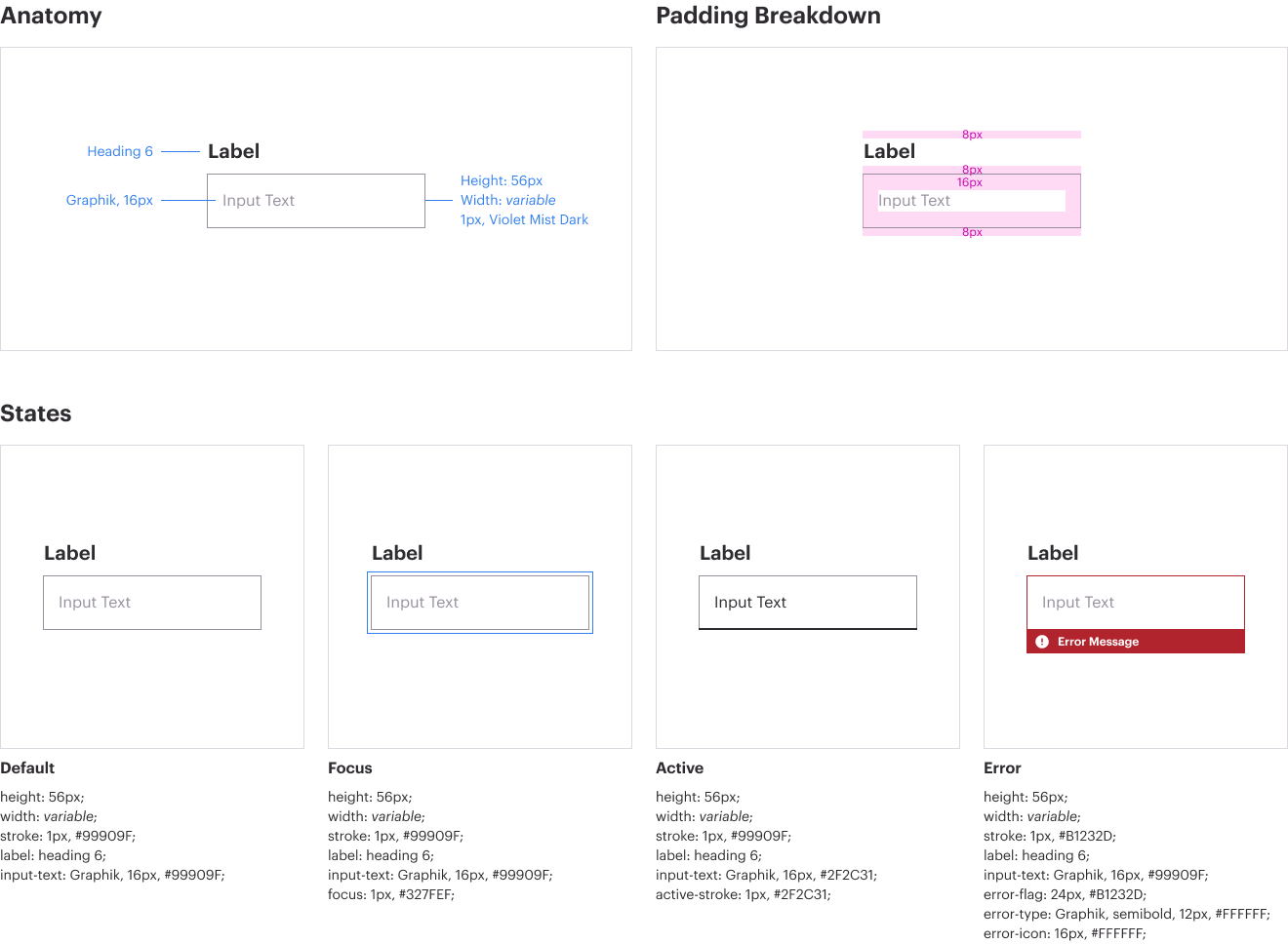
Text Input
Text inputs enable the user to interact with and input content and data. Text inputs are used when the expected user input is a single line of text, as opposed to a paragraph.
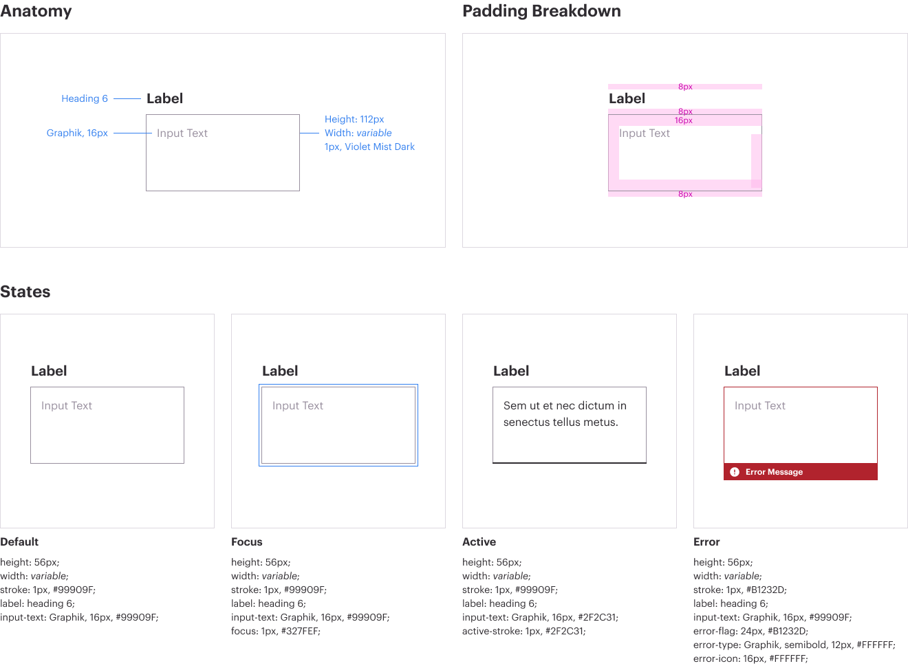
Message Input
Message inputs enable the user to interact with and input content and data. Message inputs are used when the expected user input is more than one sentence.