A stand-out, violet bar serves as a call-to-action (CTA) that brings visual contrast and calls the user to take action.

The Call to Action module uses a flooded violet background to establish visual distinction for the user, and to emphasize the importance of this module for us and the user. By using this component on a page, we’re saying “this is potentially the most important thing we’re showing you right now – pay attention!”

call to action module design details

<section class="mb-5">
    <div class="container cta-bar">
        <div class="row align-items-center">
            <div class="col-12 col-xl-7">
                <div class="row">
                    <div class="col-12 col-xl-10">
                        <p class="text-white font-mono-small font-weight-semibold">Lorem ipsum eyebrow</p>
                        <h3>Title here - be succinct</h3>
                    </div>
                </div>

                <p class="mb-5 mb-xl-0 text-white">As a valued member of the product name, you’ll get access to a cache of quality, innovative and turnkey products and tools from industry leader WTW, plus permanent cart, order history, product reviews and hot products.</p>
            </div>

            <div class="col-12 col-md-3 col-xl-2 offset-xl-3">
                <button type="button" name="button" class="btn btn-lg btn-primary arrow-link text-white float-xl-right" aria-label="Learn more about our 2019 XYZ Survey">
                    Learn more
                    <span class="material-symbols-outlined" aria-hidden="true">arrow_forward</span>
                </button>
            </div>
        </div>
    </div>
</section>

All elements of the module should be used: the eyebrow (which should be the “type” of featured content – not a date), the name of the page that the user will navigate to if they click the button, and a blurb about why the user should navigate to the page. The button on the right should be succinct and direct.

All elements must meet WCAG 2.1 AA criteria.

The aria-label text must be descriptive of what will happen if the user chooses to press the call to action button.

A good use case for this module is if a specific page references purchasing a report from our Data Services site. In that instance, the button could read “buy the report” and clicking on that button would bring the user to a Data Services site link that would have the report.

Or, this could be a doorway to a product (like Radar). The button could say “Log in” and if clicked would take the user to the Radar login page for the actual product.

This module, while it can be used to feature reports, should be used with caution because we do not want to dilute its visual power. For most standard featured reports, consider using one of our Featured Content modules.
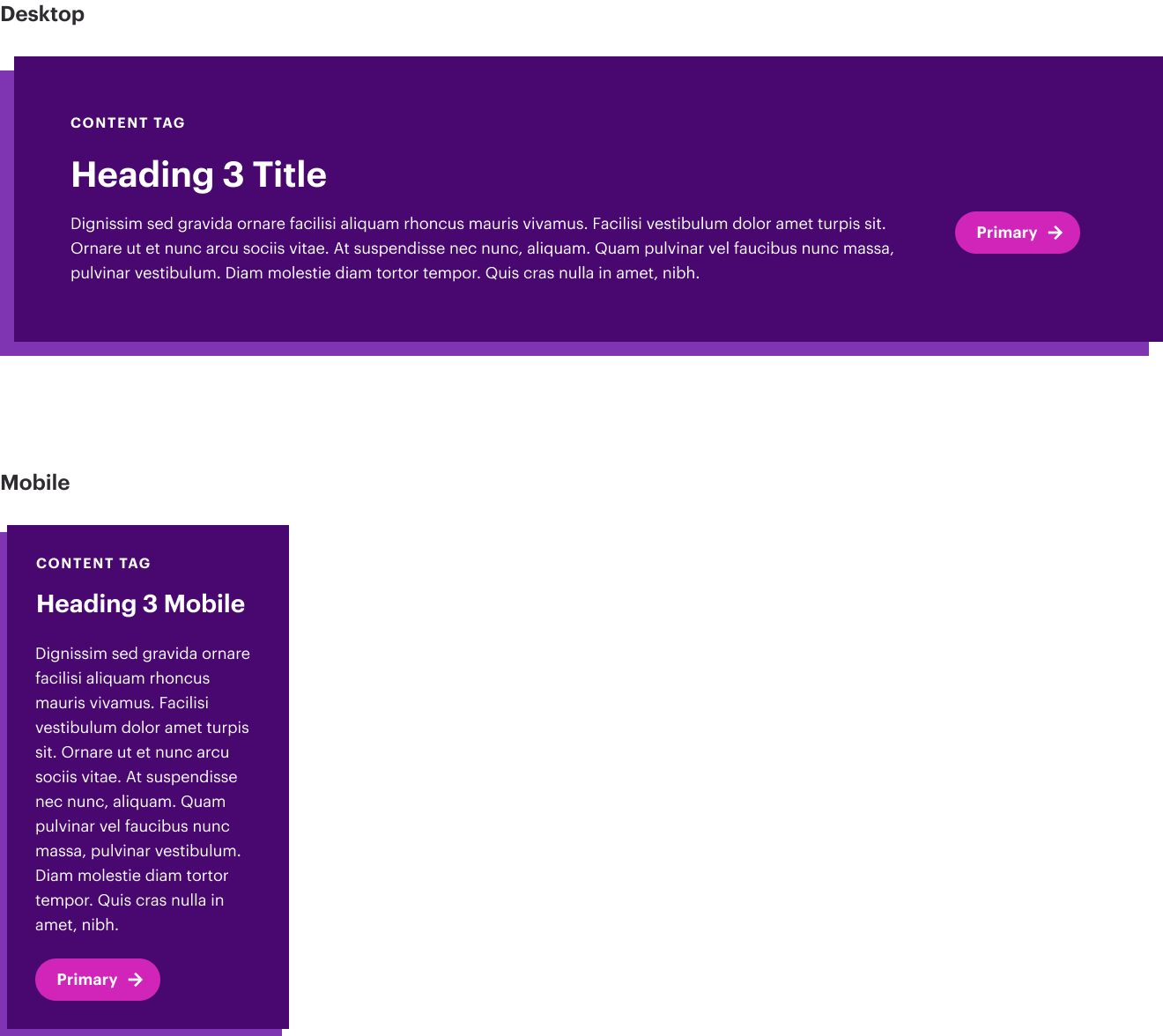
Key specs

  • One CTA module per page maximum
  • Use aria-labels to specify more about what lies behind that button in order to comply with accessibility
  • This module should be a unique, attention-grabbing module. Do not use it on every page.

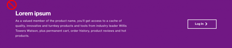
The module requires all of the following:

  • Violet background and white text (cannot be changed)
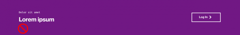
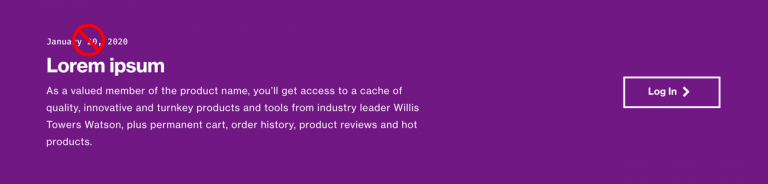
  • Eyebrow tag – defines the type of thing the user will be navigating to (report? insight? research? login?) or something pertinent to the user. Must not be a date/time.
  • Title – Generally the item’s name – the report, the survey, the research, the product name.
  • Detail – 1-2 sentences that describe why the user really should click through on this module.
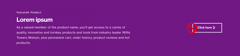
  • Call to action button – Fewer than 20 characters, short and succinct. The aria-label (coded) must provide more detail from an accessibility standpoint.

Do not use dates or timestamps (or other text) in the eyebrow tag. The eyebrow tag must be used to define the “type” of what is being featured.

alt text

Do not use generic “click here” statements in buttons.

alt text

Do not display this module without the eyebrow.

alt text

Do not display this module without the detailed paragraph text.

alt text