Image Specifications Web And Digital Properties
For WTW’s external website, there are very specific file sizes and specifications for imagery. Additionally, there are overall web image guideline specifications. Please consult all before supplying/preparing imagery for WTW digital properties.
These rules are established with best practices for content delivery, accessibility (legal ramifications), usability, mobile delivery, and consistency.
All imagery must be created to Design Guideline Specifications as found in Brand Central. Do not use Brand Central templates to export your own web imagery.
Imagery Guidelines (Dos and Don’ts)
Below you’ll find our guidance for imagery for wtwco.com.
Keep imagery on-brand. Review the Primary Brand strategy on Brand Central. Imagery should align with our photographic or illustrative standards.
Unless designing a standalone infographic or proof point, try not to put text on imagery. This causes mobile and accessibility issues. For more information on Infographics, review the Infographic Guidelines posted on Brand Central. There are very few exceptions to this rule. From an accessibility standpoint, imagery is particularly difficult. Screen readers cannot “read” text on imagery, and screen readers are what the visually-impaired use to access the content on our website. Since all content must be available to all users, any text put into a graphic must also be included on a web page in a screen reader only class. Steer away from putting paragraphs of text on images and instead use HTML.
Imagery file size is affected by our image content delivery network. We have invested in a content delivery network (CDN) that helps us deliver optimized images, resized for viewports (e.gdesktop vs. iPhone 7 vs. Android), and optimized so that the image asset file size is reduced as much as possible without losing quality. This applies for wtwco.com only; other imagery created in the WTW brand should strive to adhere to similar optimization principles: the assets should be as small (file size) as possible while retaining image quality.
Do not use pixelated or distorted graphics.
Provide the correct file type. Know when to supply a JPG vs. a PNG/SVG. Photography should be provided in a .jpg format. Illustrations (especially if a it has text, for instance a logo) must be provided as .pngs. A .jpg is not a proper format for anything including illustrations or text.
Opt for HTML components over imagery, especially when conveying data (in tables) or simple statistics. For all the reasons documented in this entire digital style guide, avoid text on imagery as much as possible.
Do not use Brand Central templates to export your own imagery. These were not created for the web and therefore do not have the correct accessibility/design guidelines.
Do not use PowerPoint, Excel charts to export your own imagery. These were not created for the web and therefore do not have the correct accessibility/design guidelines.
Image Specifications
The specifications below are for wtwco.com. Scroll down below for examples of these types of imagery on wtwco.com.
| Type | Width (Pixels) | Height (Pixels) | Ratio | Suggested File Size, Type, Quality | Notes |
|---|---|---|---|---|---|
| 16:10 Standard Size – Photograph or Illustration | 2880 | 1800 | 16:10 | Aim for <500KB JPG if photograph PNG if illustration Min 72 dpi Max 150 dpi | Solutions Hero Images, Featured Article Images, Article Page Main Dominant Image |
| 1:1 Square Photo Authors, Bios, People Headshots | 485 | 485 | 1:1 | Aim for <500KB JPG only Min 72 dpi Max 150 dpi | Authors, Biographies, Photos of people. Bio photos usually display at 165×165, so it’s okay to have a smaller photo here, but the ideal pixel dimensions remain 485×485. |
| 1:1 Square Icon Product Icons, Generic Icons, Ordered List Featured Icons | 150 | 150 | 1:1 | Aim for <100KB PNG or SVG; SVG preferred SVG mandatory for software product icons **added by Global Design Team | Used within the Featured Products module for our Software Product icons. Must be created on a 150×150 artboard and must not have white space padding. Note that software product icons are added to Sitecore when they are created and should not be added separately. |
| Full-width inline imagery Rarely used | 1140 | N/A; variable | N/A; variable | Variable file size; optimize as much as possible. Min 72 dpi Max 150 dpi PNG (illustrations, infographics) JPG (photography) | Recommended size for inline imagery when the image will be displayed at the full width of the page. Rarely used |
| Inline imagery – Capabilities & Insights”Main column” section | 900 | N/A; variable | N/A; variable | Variable file size; optimize as much as possible. Min 72 dpi Max 150 dpi PNG or SVG (illustrations, infographics) JPG (photography) | Recommended width for imagery that will display on all pages within the main columns of each page. Height is variable for inline imagery. Refers to any imagery that is not a “featured” item or main hero image. Must be within the content of a page. |
| Small inline imagery – Solutions & Articles Rarely needed | 635 | N/A; variable | N/A; variable | Variable file size; optimize as much as possible. Min 72 dpi Max 150 dpi PNG (illustrations, infographics) JPG (photography) | If an image does not need to display full-width of the column (which most imagery should/does), the website can display content at 1/2 the column width size. This is done in browser. Please provide these images (typically small charts, 1-2 icons, etc) at a max of 635px. |
| Main Navigation Vertical Panel (Photograph) | 960 | 1824 | N/A; variable | Aim for <500 KB Min 72 dpi Max 150 dpi JPG | This is only used for the panel navigation in the main menu, and should be a resize of the page’s hero image. Should be a photograph in JPG form. |
| Landing Page Banner Image e.g. “Static” Hero Image Used on trending topics, content hubs, and general landing page templates. | 2880 | 500 | Aim for <500 KB Min 72 dpi Max 150 dpi JPG | This is only used for static banner hero imagery on landing page templates. This is not by default in Sitecore and must be created by a designer for specific pages when needed. | |
| Sublogo Branding Bar Image | n/a | n/a | n/a | SVG | Only used for approved sublogo page treatments. This scales to fit width/height as appropriate. Please provide the logo in its natural state (no padding/borders/background) in SVG format and the image will display appropriately. |
Social Media Image Specifications
Social media specifications are found on Brand Central.
Always ensure the social media image matches the main “identity” of your page, if it has one.
For instance, if a service page has a specific hero image, this must be used as the source for the social media image. A request for a new page on wtwco.com must always include an associated social media image. Please reach out to a designer to create the appropriate social media image.
As a marketer / page owner, if your page does not have a main “identity” or specific image, the web team has a set of generic social media images that you can choose from. Remember that this is discouraged unless absolutely necessary as it does not represent a consistent visual identity for the page. If possible, try to use a social media image that matches the hero image of the page.

Image Examples
Imagery examples related to the specifications above.
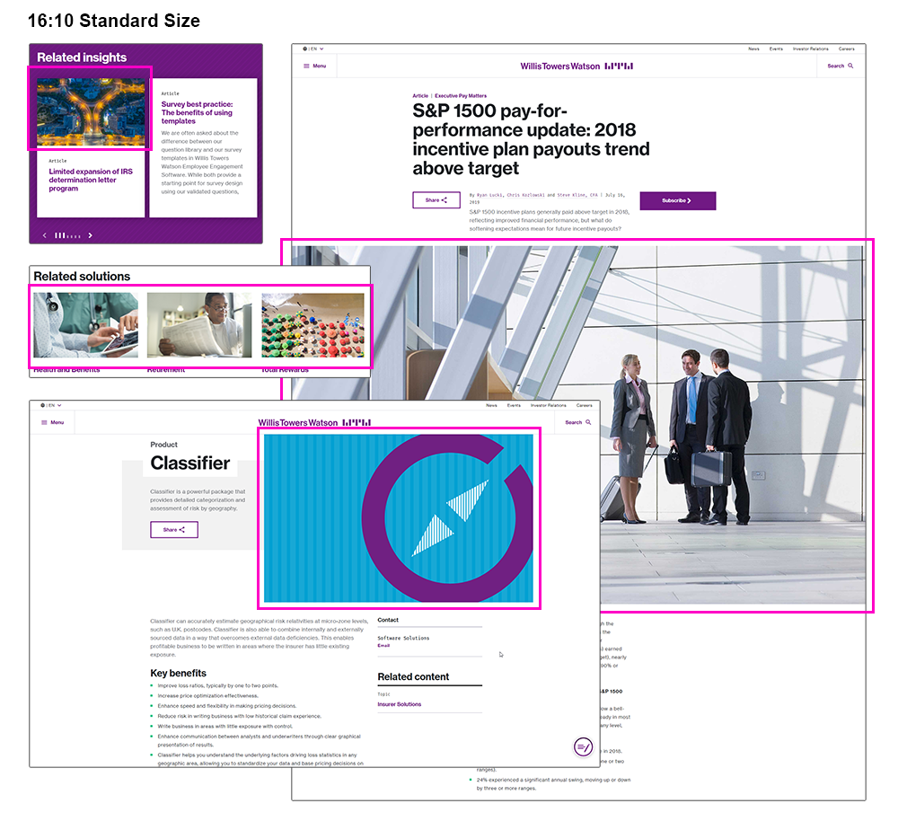
16:10 Standard Size
This is the standard dimension for mostly everything on wtwco.com. Use the listed size, and our CDN resizes the images per container.
Related carousel cards, full-width featured images for articles, featured content cards, capability heroes, etc.
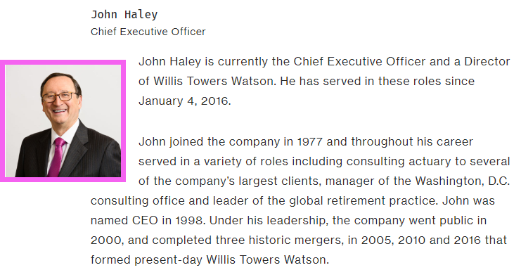
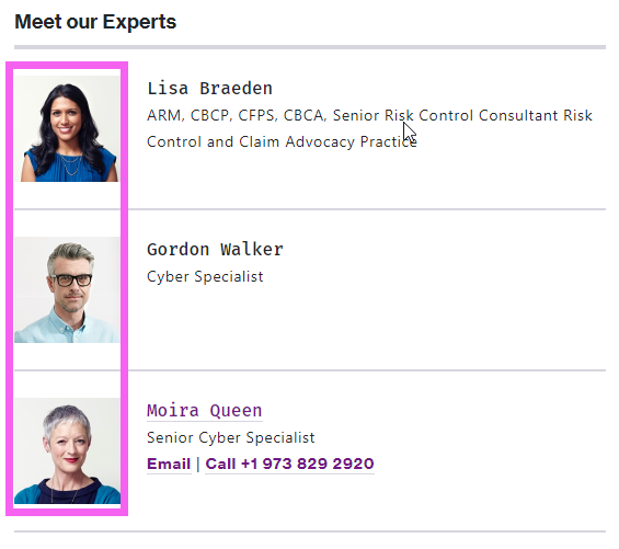
1:1 Square Photo (Authors, Bio, People Modules)
1:1 Square Icon (Product icons, illustrated icons, ordered list featured icon images, statistic icons)
Full-width inline imagery –
if this is photography, you can actually use the 16:10 dimension and it will dynamically resize down. However, the width here is generally prescribed for when a chart or other inline graphic needs to be full-width. If you are creating this, please use the standard specs for typography. (Rarely used)
Standard inline imagery –
Simply put, imagery that exists in the main columns of any page. Remember, the inline imagery should not include headlines/captions. Those should be taken care of in HTML. If the image contains text, any of the text must also be provided in a text-based format for accessibility.
Small inline imagery
This refers to imagery that will not span the full width of a standard page column (deliver at 635px wide, variable height).
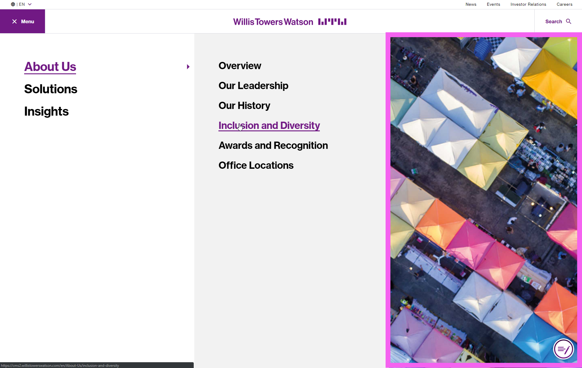
Main Navigation Panel
Maintained by the UX team, this is a specific asset that needs to be created for second-tier navigation elements.
Landing Page / “Static Hero” Banner
This is a full-width image that spans left-to-right.
Remember that the title of the page will overlay the banner, so banner should take care to keep important visual information outside the main area of the page.
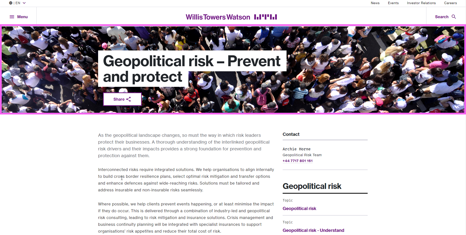
Image accessibility checklist
Imagery requires dedicated attention to accessibility, as any content that is found within an image cannot be read by a screen reader and cannot be processed for SEO, both of which are legal and strategic requirements.
(Consult image accessibility guidelines for more information on alt text and screen reader only class for more information on complementary text for complex images).
The basic rules are as follows when using an image (displays as ![]() tag in HTML):
tag in HTML):
- Is the image informative and simple (can be communicated in less than 125 characters)? It needs alt text.
- Is the image informative and complex? It needs alt text and additional, complementary text using the Screen Reader Only Class.
- Is the image decorative? It does not need alt text, but does need an empty alt tag to indicate that it is decorative.
Accessibility checklist for specific images on wtwco.com
Hero banner images (without text)
- No alt text required; they are decorative-only. The text for the name of the page is completed in HTML and is already SEO- and accessibility- friendly.
Graphics with information (Charts, graphs, data visualizations, stylized text within a visual, statistics, proof points)
- Requires detailed text to describe what is going on in the image.
- Alt text mandatory, Screen Reader Only Class possibly needed if the information is not already within the body copy or if the description exceeds the 125 character limit for alt text
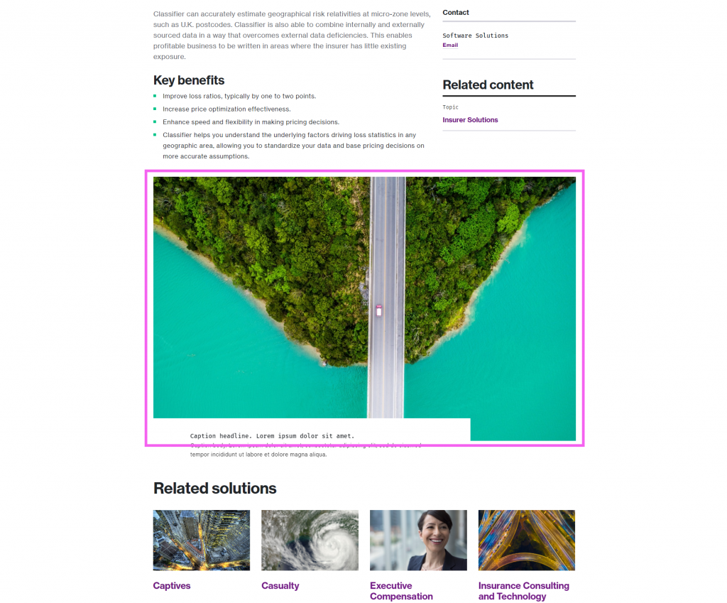
Graphics with no information (e.g. brand photography)
- If the image is photographic, for branding purposes only, and does not convey any information, then it is decorative.
- Requires
alt=""empty tags to indicate that the image is not important to screen readers.
Photography with people (e.g. a headshot, a bio photo, group photos)
- This guidance applies only for photography where people (who are known people, e.g. consultants, colleagues, etc.) are included
- Requires
alt="description here"to indicate what the photograph contains
Infographics
- Requires detailed text to describe what is going on in the image either directly on the page or within the screen reader text.
- Alt text mandatory, complementary Screen Reader Only Class mandatory
Icons (visual icons w/ no text)
- Do not require alt text because we always associate our icons with text in HTML. Therefore, the icons are decorative-only.
- (In the rare cases that icons are communicating information, and there is no supporting text, there must be alt text, and you should use the accessibility guidance above for “graphics with information” )
- If the icon is displayed in an
tag, it requires
alt=""empty tags to indicate that the image is not important to screen readers. - If you are using the web icon library, which is a webfont, you must use the proper ARIA status for each icon to ensure that the screen reader does not read the data behind the icon. It requires
aria-hidden="true"