About The WTW Digital Design System
Our digital design system considers many facets of brand experience: user experience, user interface design, interaction design, accessibility, and usability.
The digital design system is an extension, not a deviation, of our overall WTW Primary Brand. Key elements – typography, photography, iconography, color palette – are similar to our overall Primary Brand, or are the same. In some instances, design guidelines may be extended (for digital use), or enhanced with animation. While this standards site discusses our approach from an atomic design framework, we’d like to address some of the key aspects of the system here. Below, you will find answers to frequently asked questions.
Our digital design system is/has:
- Usable and engaging. Delightful. Mobile-equal.
- Clear space, light, airy.
- Pops of color to intrigue and delight the user and provide context for usability.
- Legible, clean, modern, accessible.
- 2D/Material-based design.
- Minimal shading/gradient effects.
- Balance of rounded shapes and square corners.
The purpose of the WTW Digital Design System (WTW DDS) is to provide a consistent user interface and design resource for those working with the WTW Primary Brand.
The WTW DDS includes visual examples, code snippets, downloadable design assets for designers, and more. Also included are baseline UI and UX notes regarding usage for each element.
This DSG also includes reference material on the following subjects:
Atomic Design System (Components)
Our design approach for WTW is centered around an atomic design methodology, which many refer to as “building blocks”. This allows us to construct a cohesive design system that is comprised of small, individualized components. These components can then be combined together and built upon to form large sections of an interface .
Our components are broken down into four categories of increasing complexity: atoms, molecules, organisms, and templates.
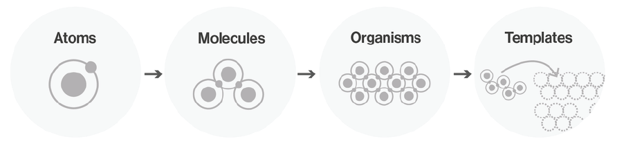
- Atoms represent the most basic building blocks of the interface. These might include simple html tags, as well as more abstract interface elements like color palettes and fonts.
- Molecules are groups of atoms organized together to form slightly more complex, tangible interface elements. These might include a search form or dropdown list. These molecules provide us with some reusable building blocks that we can now combine to make organisms.
- An organism is a group of molecules joined together to form a relatively complex, distinct section of the interface. These might include a header or footer section.
- Finally, templates consist mostly of groups of organisms stitched together to form pages, which more closely represent the final interface. This atomic approach allows us to more easily maintain design consistency and cohesion across the entire interface of the product.
Documentation
Our digital design components have been extended to specific platforms and for specific use.
We have extensive documentation on email (Marketo), media (Brightcove), and wtwco.com-related guidelines.
Our Overall Design Principles:
The user comes first. Our website content should engage with our users on their level.
Be accessible. We follow WCAG 2.1 Level AA requirements for accessibility, for usability and legal reasons. This means that imagery, videos, and podcasts all have special guidelines, all outlined within the Digital Style Guide and Brand Central. Content cannot be added to the website without meeting proper accessibility standards.
Design for all devices. Mobile and tablet content consumption is on the rise, and content should be available to the user on the device (and browser) of their choice.
People will scroll – if you give them a reason to. Statistics prove that people will scroll, if you give them a reason to scroll. Content needs to be crafted in a dynamic, engaging way. Use visual cues and interesting content.
Do not rely on PDF downloads or dynamic PDFs to relay information. PDFs have many limitations: it is difficult to track engagement time, they are held to the same accessibility requirements as standard content (and could be a liability if accessibility requirements are not met), they are not mobile-friendly, they cannot be shared as easily as regular web pages. While not disallowed on wtwco.com, PDFs should be considered content that is complementary to the user experience. Any information within the PDF should be available in HTML on a wtwco.com web page.
Use white/clear space. Our design system relies on the user’s eyes being able to “rest” in clear spots on the page. Resist the urge to fill every section of the page with content. Let the user’s eye peacefully scroll down the page.
Follow image design guidelines for the web. Imagery is used to convey information or delight the user, but it needs to be on-brand and follow accessibility requirements. All of this information is documented on Brand Central. Imagery will not be posted unless it complies with those guidelines.
Write content that is “bite size” and easily understood. Verbose paragraphs describing information will lose user interest. To encourage engagement, break content up into short bullets. Use formatting. Never use terms like “click here to.” The user interface already cues the user that they can interact with text that is a button or a link.
Our Digital Design Approach
The primary palette is reinforced constantly within main user interface elements. Other colors and patterns are used to reinforce the Primary Brand. We have modified the WTW Violet for the digital space so that it resonates warmly with our users. (Note that this is a deviation from previous web-based violets).
The “primary” digital design system color is white / clean space. Resisting the urge to clutter a page with too many dark elements will result in better user experience, and more engagement.
Modular Design
Our design elements work across different layouts to achieve different user experiences.
Frequently Asked Questions (FAQ)
Why and how is the digital design system different than the overall Primary Brand? Simply put, digital deliverables have specific constraints, guidelines, and specifications for users, production, and application. Additionally, digital deliverables (anything from an ad banner to a full website) are held (legally) to accessibility and usability standards. We discuss accessibility in our reference section, but the rules provided for any of the styles (especially in relation to color) in this guide were created with very specific intent in order to best comply with our brand and adhere to legal parameters (as defined within WCAG 2.1 Level AA guidelines).
Why can’t I use the overall brand guidelines when developing a website? Digital interfaces require specific attention to accessibility and usability. Our overall brand guidelines discuss the spirit and main intent of the brand, but they do not address specifications for the digital environment. Contact Katie Cisto with any questions.
Can you review my website for brand compliance? Yes, absolutely. Any websites using the WTW brand should be reviewed by the Digital and Brand teams. Please log a ticket on the Brand Central Help Desk.
Can you review my (microsite, website, application) for accessibility compliance? Not fully. We can provide accessibility feedback based on the visuals of your website that incorporates the WTW brand and digital design system, but accessibility compliance is much more than a visual inspection. When engaging vendors, make sure to include WCAG 2.1 Level AA accessibility requirements and testing in your SOW to ensure that the code-based accessibility requirements are met. They must ensure and prove accessibility compliance for screen readers, etc.
If I’m engaging a vendor to build something for me, what should I know? Provide access to this style guide. Ensure that brand compliance and accessibility compliance & testing are referenced in the SOW. Make sure they are building websites that are mobile-equal and that they are doing cross-browser and cross-device testing. Review with the Brand and Digital teams (Katie Cisto, Molly Fisher) in early stages of design; brand compliance items are less expensive to address in the design phases (vs. in the development/prototype phase).
Why are the colors different in the digital brand? The digital space needs to take a few things into account: luminosity, monitor quality, contrast, etc. Certain colors will display well in print, but fail to render properly in digital.
Accessibility also plays a huge part in the rules for colors. For example, links must have contrast from the rest of the text, and must be clear to the user. Hover states (sometimes provided by color) must be significant enough to work for all users; colors become tricky when working with colorblindness.
Does my website need to have the digital brand applied? Generally speaking, if your website falls under the WTW Primary Brand, then yes – you should implement the styles found in this guide on your website. If you are engaging a vendor, we can provide them access to this style guide as well as our Bootstrap 4 codebase. The code is based on the wtwco.com structure so vendors will need to take the toolkit and extend as needed for their own purposes. If you are working on a software application, note that the Software Brand has not yet adopted some of the new digital styles from our updated standards. Those creating software (applications for use by our clients) should use the standards found at our overall Software User Experience Guidelines.
Do I need to review my website or digital deliverable with anyone? Yes, any digital piece using our WTW Brand must be reviewed by Katie Cisto, and Molly Fisher.
I’m writing content for the web. Are there any best practices? Who should I talk to about writing for the web? Joe Cannizzo leads our Editorial team and can field questions related to best practices for content authoring. We also have a useful set of guidelines for wtwco.com content authoring and best practices. Content for the web should be short and sweet. Think bite-size, not full meals. A good rule of thumb is to keep smaller sets of text under 140 characters – the length of a Tweet!
I need to supply imagery for a web page for wtwco.com. How do I know what to supply? Reference our Imagery Specifications page. Generally, most image ratios within our digital brand fall under a 16:10 ratio. However, there are some exceptions (e.g. inline imagery and infographics). Remember, imagery should not have a significant amount of text on it. Refer to our image guidelines on Brand Central for more information on creating infographics and inline graphics:
Who manages this style guide? This style guide is managed by the UX/Design team. Please contact Katie Cisto and Rikin Patel with questions.
Can I use [vendor such as SlideShare, etc] on my web page? It depends on the use case. We must consider GDPR restrictions, accessibility (legal) concerns, and consistent user experience. Any technology used on wtwco.com must be approved by Information Security as well as the WTW Internet development team, due to potential scripting implications. Content on WTW is held to global standards and we must ensure that we are aligned in order to comply with legal requirements. We also want to be digitally focused. Posting our content within articles helps us gain traction on social media and provides keywords for SEO, which helps our content render in organic search results.